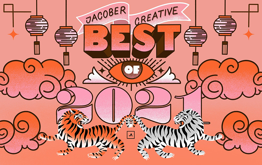
From the miles of smiles we gave to Sunny Isles to that radiating optical touch we gave to Sparkle Society; from the letting-it-all-hang-out "cheeky" Haulover Beach branding to the South Florida swank of our "Anchored in the Heart of Palm Beach" campaign; it's been both a swell (and a taste of hell) year. Now here's a short list of some of our faves and raves for 2021.

Super Size It!
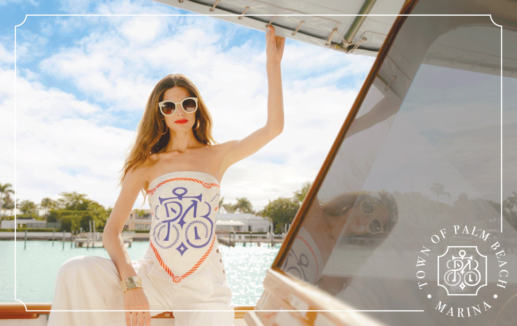
We filled out our oceanfront, South Florida portfolio even further with our toney neighbor, the
Town of Palm Beach, and its $40 million dollar Marina superyacht renovation. Our rebranding included a nautical themed logo and an integrated marketing campaign, "Anchored in the Heart of Palm Beach." From sparkling videos and photo spreads, to running point on PR and national ad buys, to great social and website work, Jacober put the "gown back on the Town." Dinner on Worth Avenue anyone?

All Over at Haulover
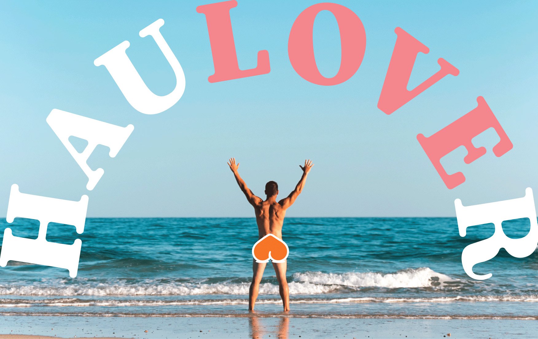
Fun in the sun, with nothing between us and the ocean breezes, is how we all know the clothing-optional section at Haulover. So how fun was it to work with
Friends of Haulover Beach on a new logo (visual "buns puns" of course), branding, content and website! The organizaton is both a way for those who like to bare their
derierre to network through HauloverNudeBeach.com, and to give financial support to the non-profit stewards of this unique strip of sand. Positive body acceptance, the naturist life and respect for all are things we can really get, well,
behind. Here's to a new year and letting our freak flag fly, freely!

The Height of Living
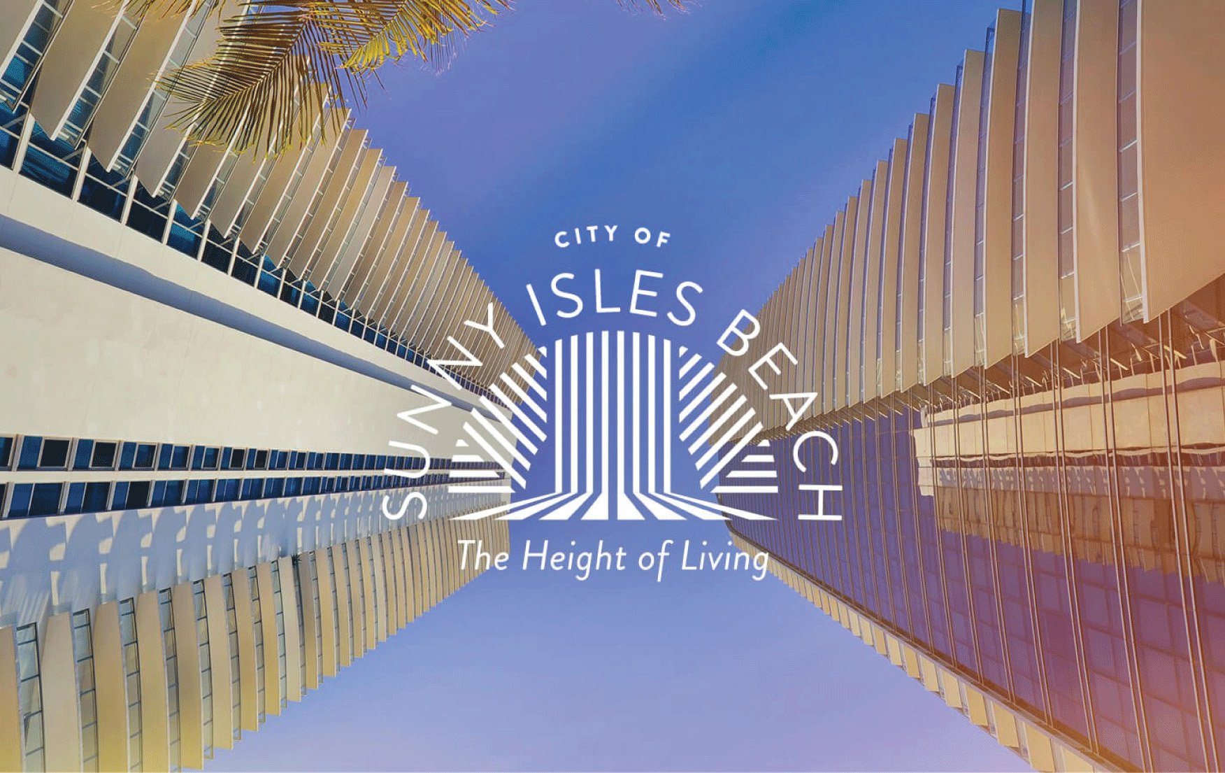
This year saw Jacober Creative continuing our two-year contract with the
City of Sunny Isles Beach (which we clinched originally through a competitive RFP process). Our winning concept included a new tagline, "The Height of Living" (hat tip to that shiny and new beachfront skyline). We created a highly stylized and contemporary logo representing their colossal ambitions, and newly developed core values, and mission and vision statements. The pandemic has not cooled Sunny Isles' red hot real estate market, nor its residents' desires for a family-friendly beachy but fashionable community, and our work gives them a great foundation for their sky's-the-limit future.

Z Is For Zodiac
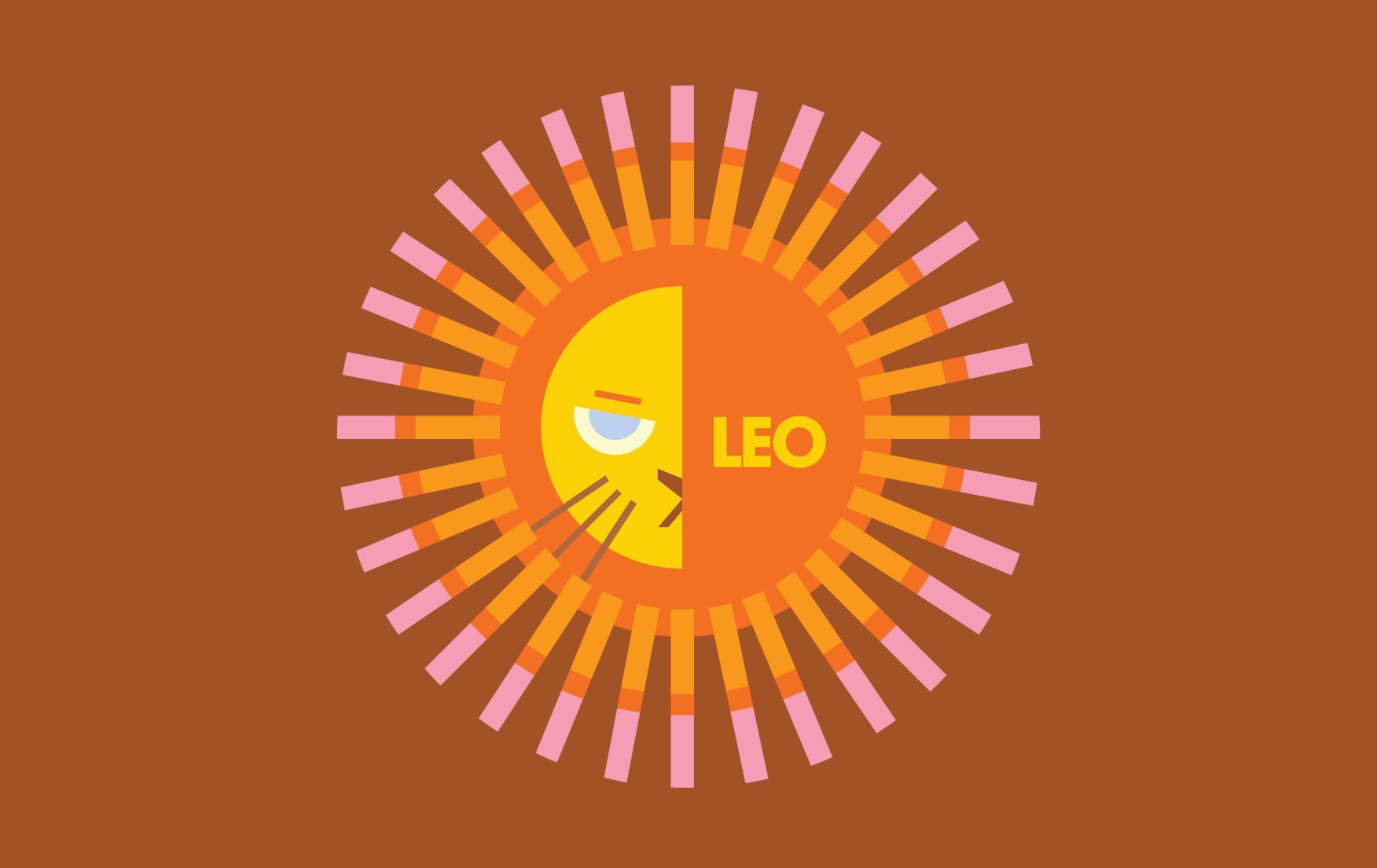
Astrology meets eye-catching design with our Jacober Creative Insta-series of monthly sign-themed images and animations. Scorpios, we know what makes you tick, Virgos, we know how you flow, Leo, we know which we you go, and we captured these and more this year as the constellations realigned. You can't always get what you want (we should know, but the stars might have some clues about how to get it, and our Zodiac-fabulous JPGs and GIFS might give you just that extra zhoosh you need. Check out our instagram handle
@jacobercreative to see more.

RFP You-And-Me
Who knew Requests for Proposls (RFPs) could be so much fun to submit, and to win! Two more that we aced this year were for upstate
Duval County and the
City of Groveland. The first involved rebranding two of their public schools, the second boosting the profile as a destination for tourists, businesses and new residents. We met their Northern Florida charm with our own Jacober style and panache. RFPs, you-and-me, coffee or tea?

Acing It
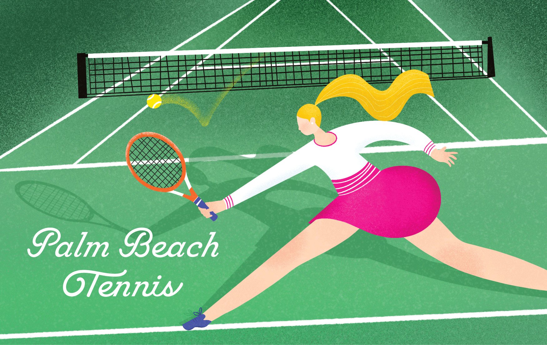
At Jacober Creative, we know tennis! From Miami Beach's Flamingo Park Tennis Center, to international tennis royalty and South Florida's own Venus Williams, and now to the
Palm Beach Tennis Center, we cover the courts. The upscale PB residents-facing venue (Melania, we see you) needed a new logo to refresh their brand. We delivered a design that captured both Palm Beach's restrained fashionable aesthetic with some bright tropical colors and a curvaceous custom font. Game-Set-Match!

The Height of Consonants
Miami Beach is always changing and growing (which is why we love having our offices here). And
Lincoln Place, the redeveloped 1601 Washington Avenue property, needed the perfect branding to continue to attract top-flight retail and office tenants to its Class A building. The logo we created for them, transforming the name into a consonants-only logo – LNCLN – was a perfect fit for their high-end but hip business model.

All That Glitters
Who doesn't like timeless jewelry you can wear out and about, and grab the spotlight?
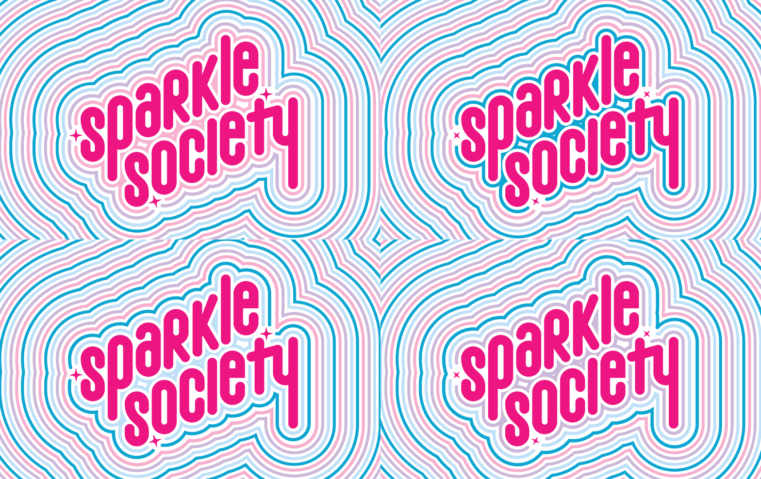
Sparkle Society, the renamed well-established Elenora Beracasa woman's line, came to Jacober Creative for a great new name and logo to launch them in the market. We created a, well, sparkly design that radiates with pop color and a fun approach. Who is their target customer? A red carpet fashion plate (think Debbie Harry) needing a new trinket for a gala opening. Rock on, Ladies!

Taking the Digital Goat by the Horns
Ibex is a disrupter in the financial space (who doesn't love some good trouble making?). This Central American Bitcoin payments company came to Jacober for a new logo, and our smooth marketing savvy. Their namesake, a mountain goat with iconic majestic curving horns, nimble and able to scale great heights (like us!), became the basis of our new design. What's in your
digital wallet?

A Dog's World (or Office)
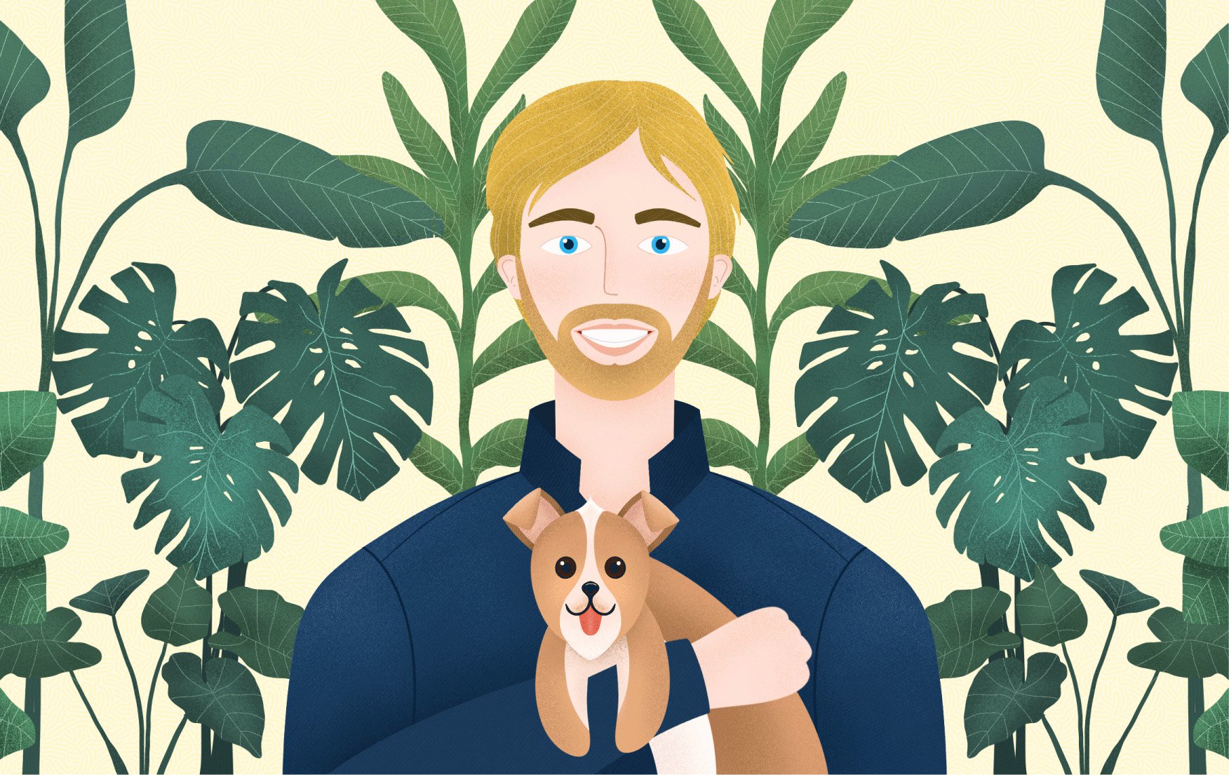
It's not all work, we had a little time for play. Joey is our newest addition to Jacober Creative office mascots (joining his Frenemy I-Was-Here-First Charlie). A special tiny wisp of a feisty pup, he loves to patrol his territory (our digs) in looping circles, and then snooze the day away in his cozy carrying case. At Jacober we know branding, we know design, we know marketing – but we also know some great dogs, and Joey is one of them.
Looking for a Creative Agency?
Are you looking for a design-focused agency to bring your ideas to life? Jacober Creative is a Miami Beach-based award-winning creative agency that specializes in branding, digital marketing, graphic design, logos, websites, and video production. Let’s collaborate. [
Contact Us]
