Illustration / Icons / Animation
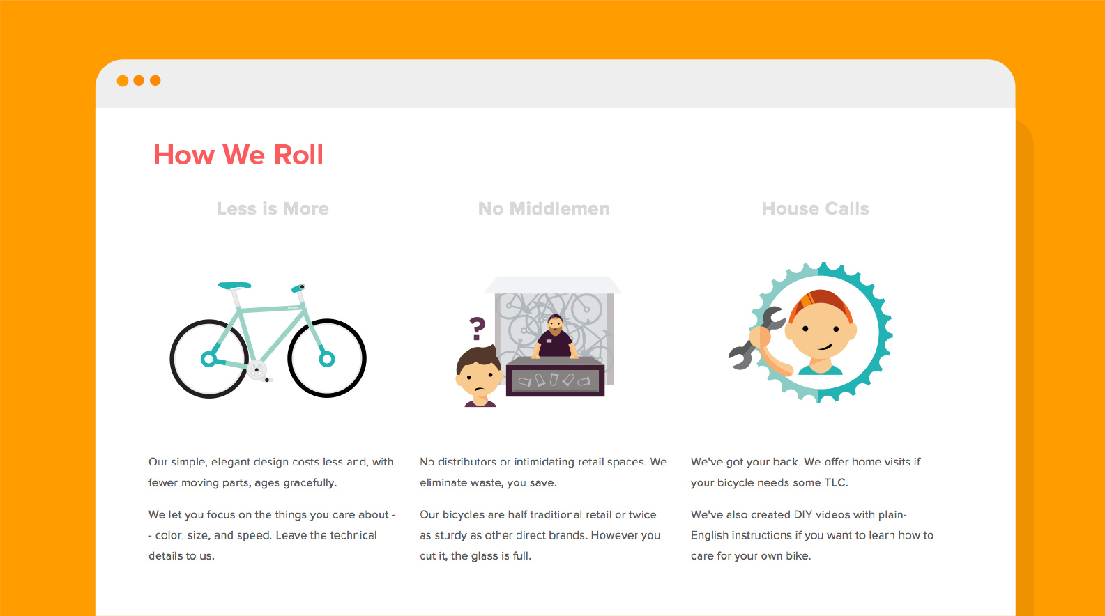
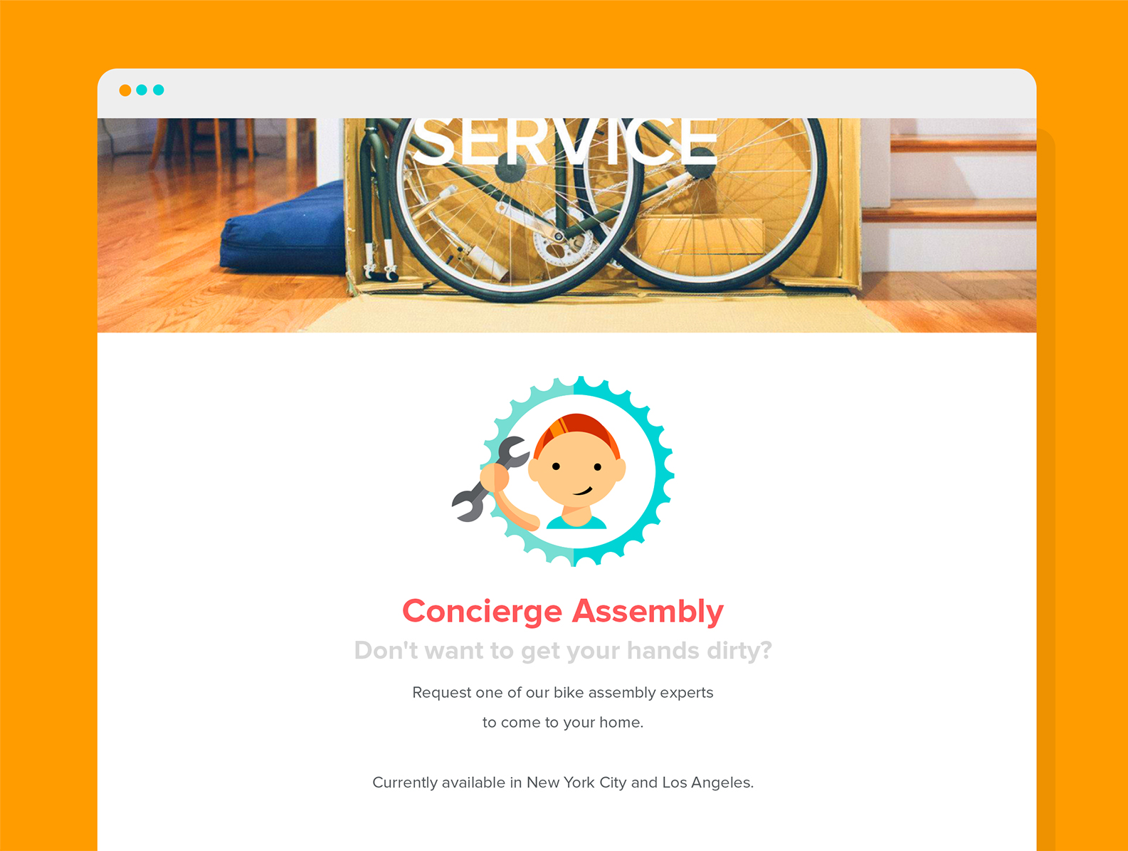
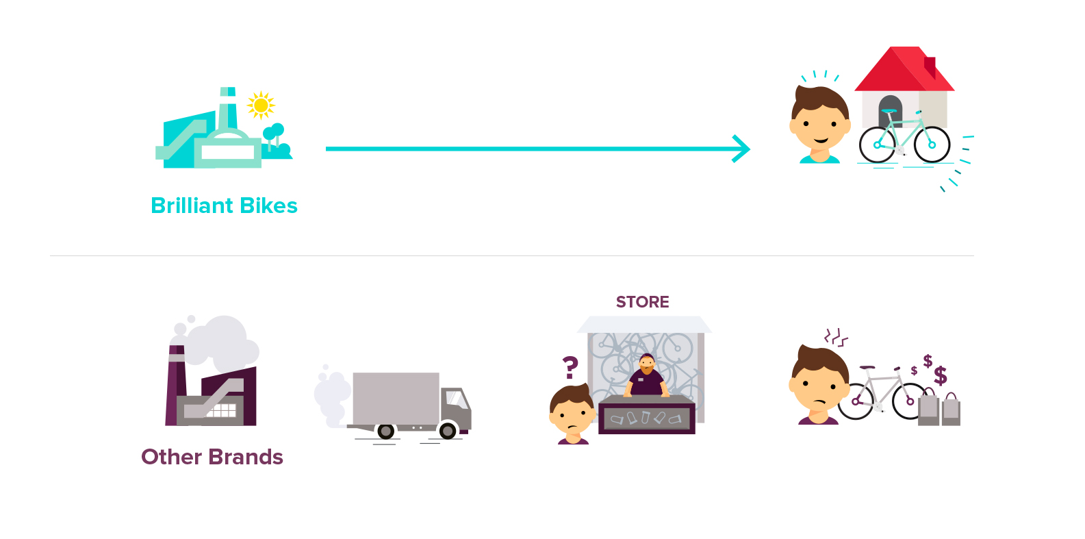
Brilliant Bikes came to us to create a (brilliant) illustrated campaign to help with their launch efforts. The ask was to create an easy-to-understand messaging and content strategy that simply and graphicly communicated the value of Brilliant Bikes. Graphic assets from this campaign were to be used across a variety of platforms, mainly their website and through a 30-second spot to drive sales.
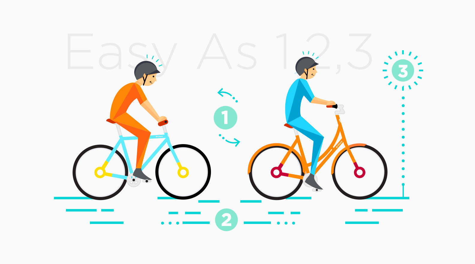
Dozens of designers and engineers work together to make every aspect of a Brilliant Bike elegant and understated -- and that was something we took to heart in trying to develop their messaging and visual aesthetic. Grabbing a potential customer’s attention was the main goal, so we developed simple and colorful characters that are both unique & sophisticated, child-like but not childish.
We're of the belief that bicycles shouldn't be expensive or intimidating, so we set out to bring the magic and lightheartedness of Brilliant Bikes to the consumer with an animated, upbeat and friendly video that quickly & easily explains the different aspects of the product.
The video narrative is based around several call-to-actions — ultimately animating the user-experience of the site:
Find Your Perfect Ride
Find Your Riding Style (relaxed, versatile)
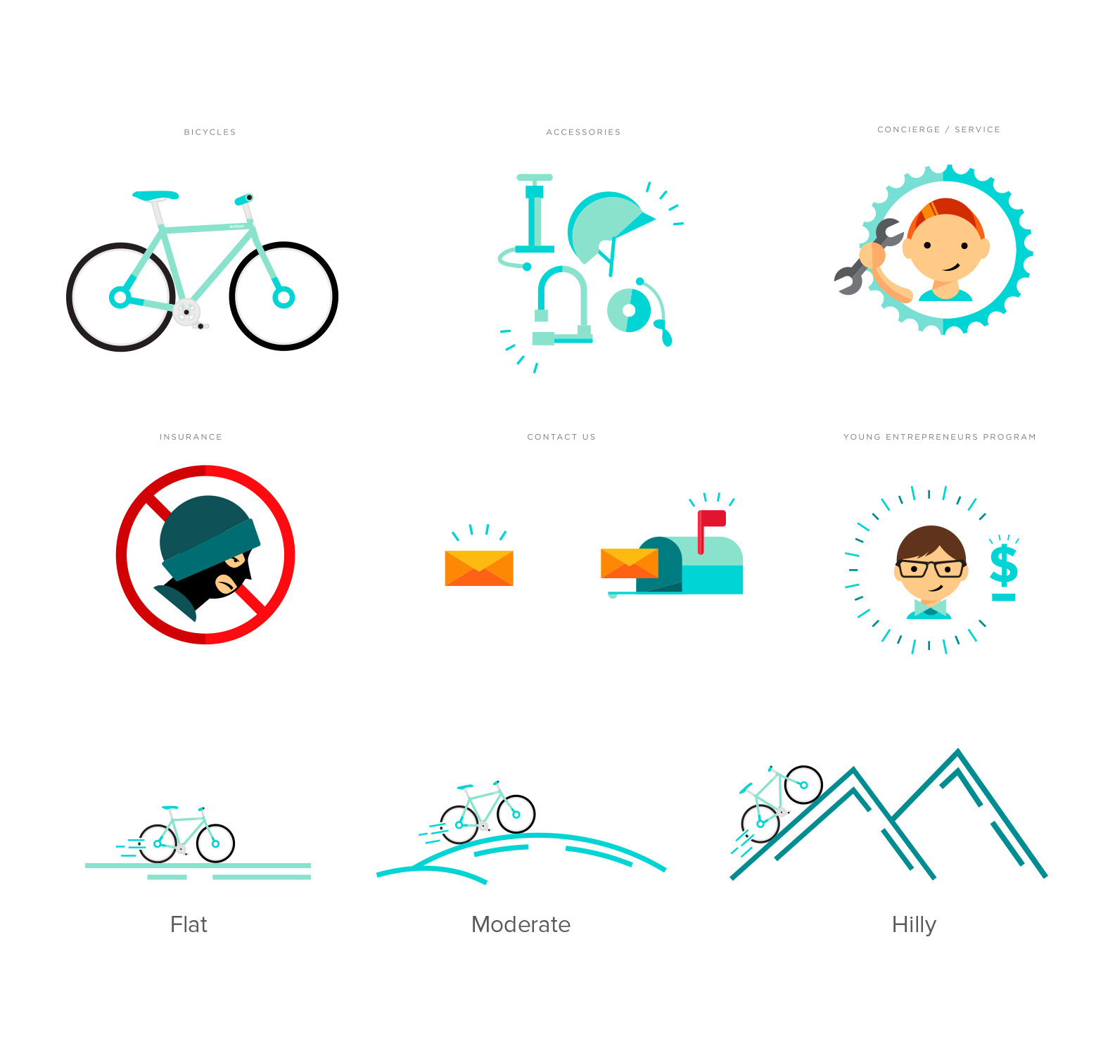
Choose your terrain (flat, variable, hilly)
Specify height
Choose color
Simple to follow, fun to watch, we loved being a part of something that ultimately looked easy, breezy & most importantly…Brilliant.
