Branding, Logo Design
As Miami's premier arts incubator, Locust Projects has been at the forefront of supporting visual artists for more than twenty-five years. With a commitment to pushing boundaries and fostering artistic risk-taking, Locust Projects sought to revitalize its brand identity to reflect its dynamic approach to arts leadership and involvement. Our own Paul Jacober served on the non-profit’s Board of Directors. He brought Jacober Creative to the table to design a new logo and a brand refresh that would embody Locust Projects' spirit of innovation and creativity.
We began with an extensive exploration of the organization's values, mission, and aspirations, delving into Locust Projects' history, its role within the Miami arts community, and the essence of its identity. Through brainstorming sessions, sketches, and mood boards, we sought to capture the essence of Locust Projects' non-traditional approach to arts leadership.
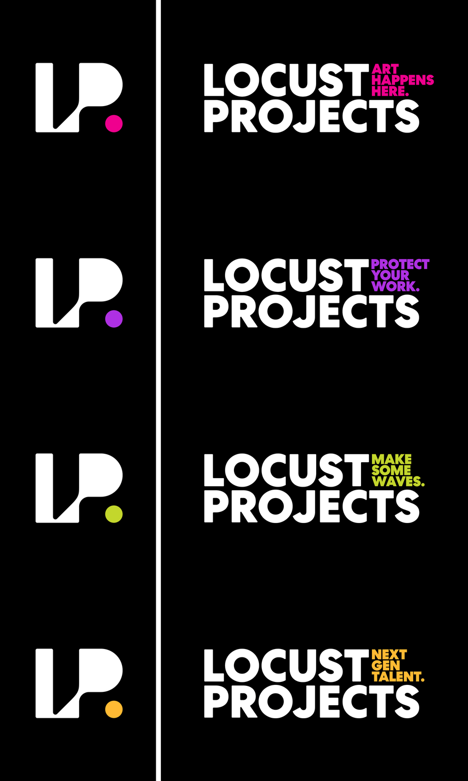
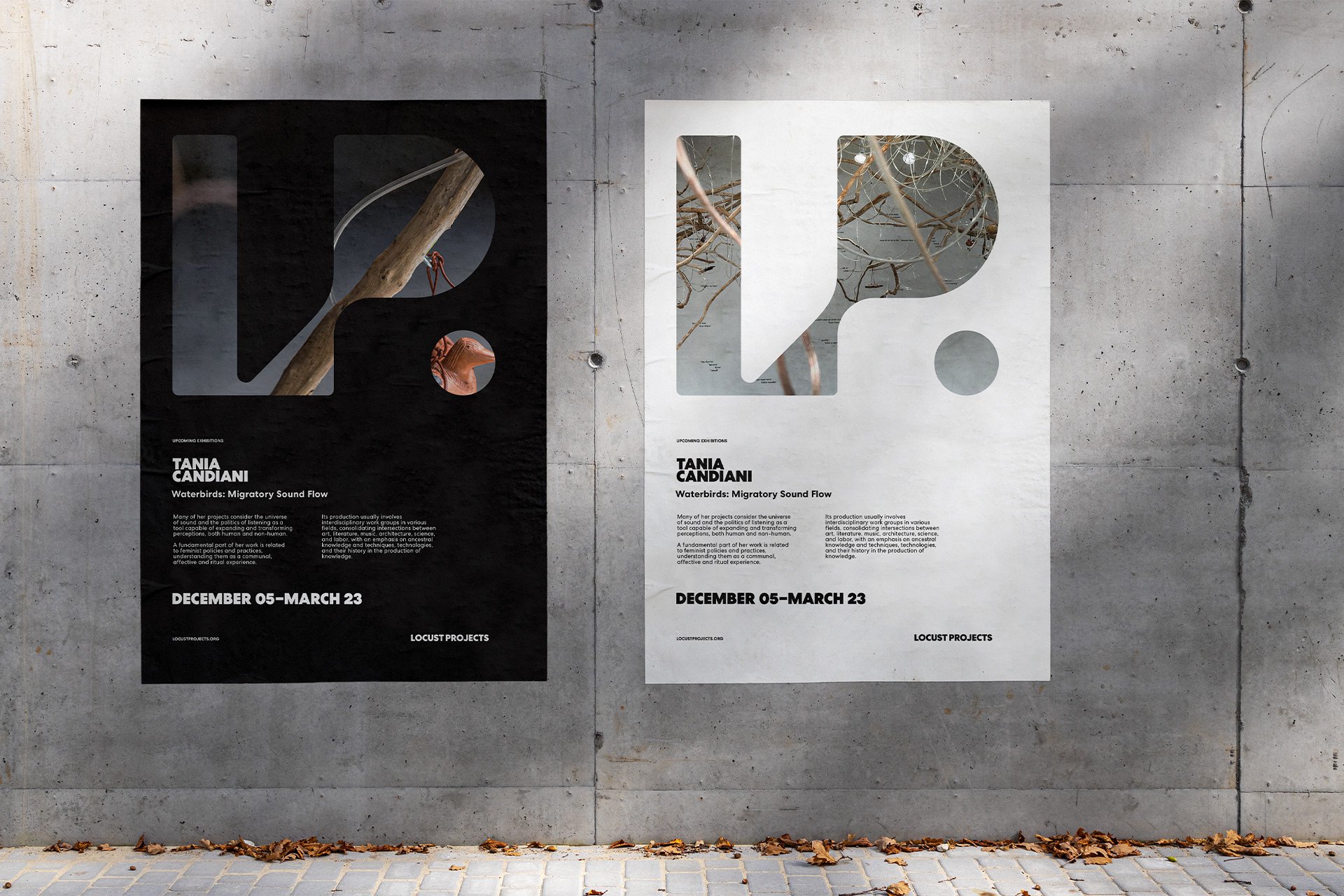
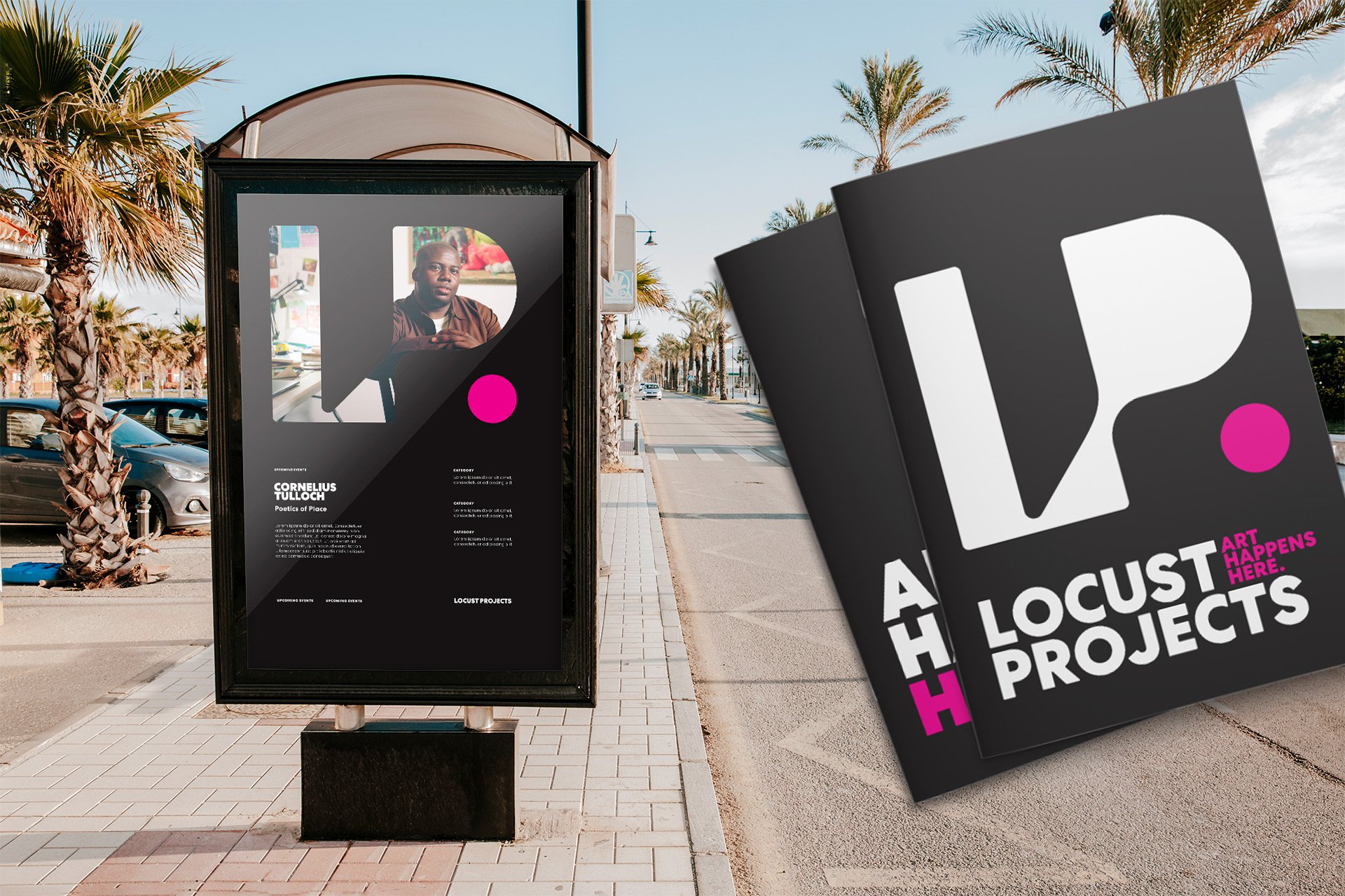
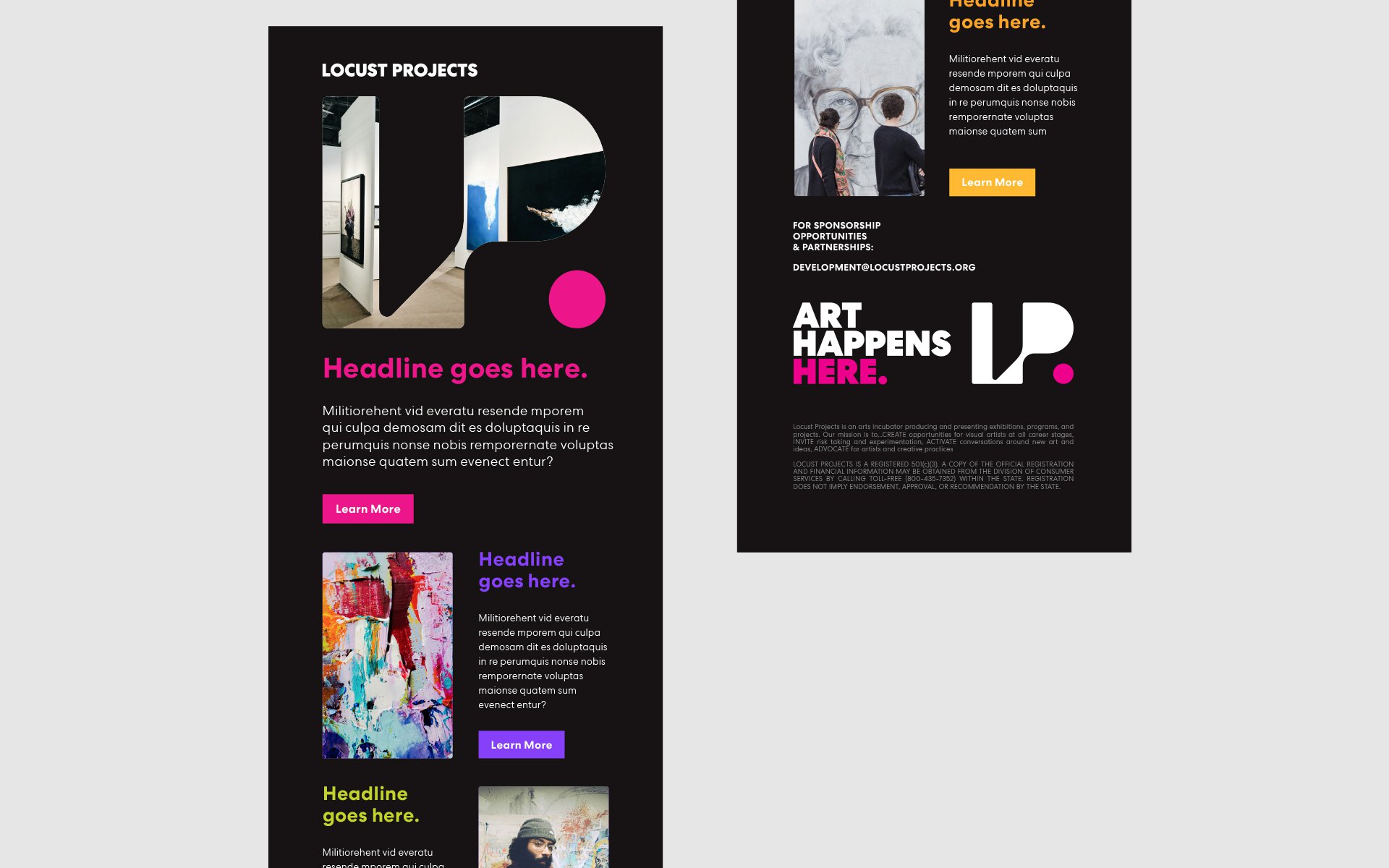
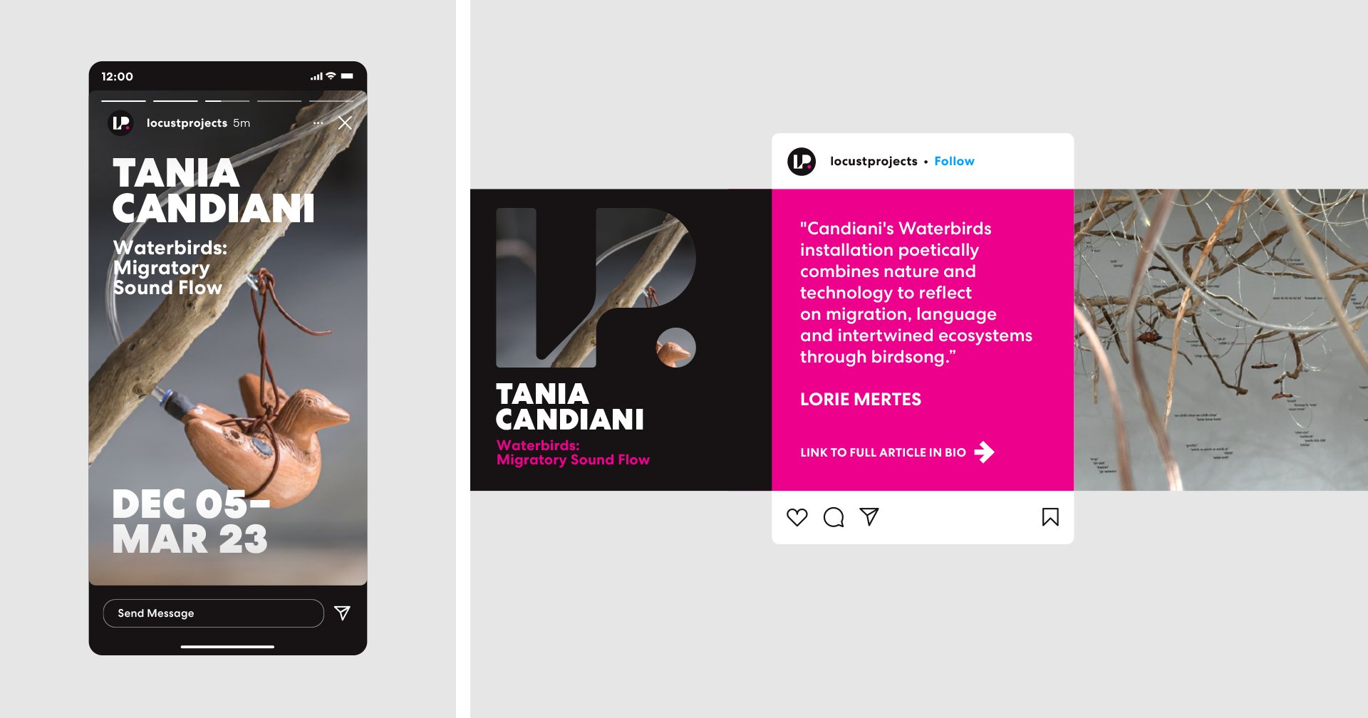
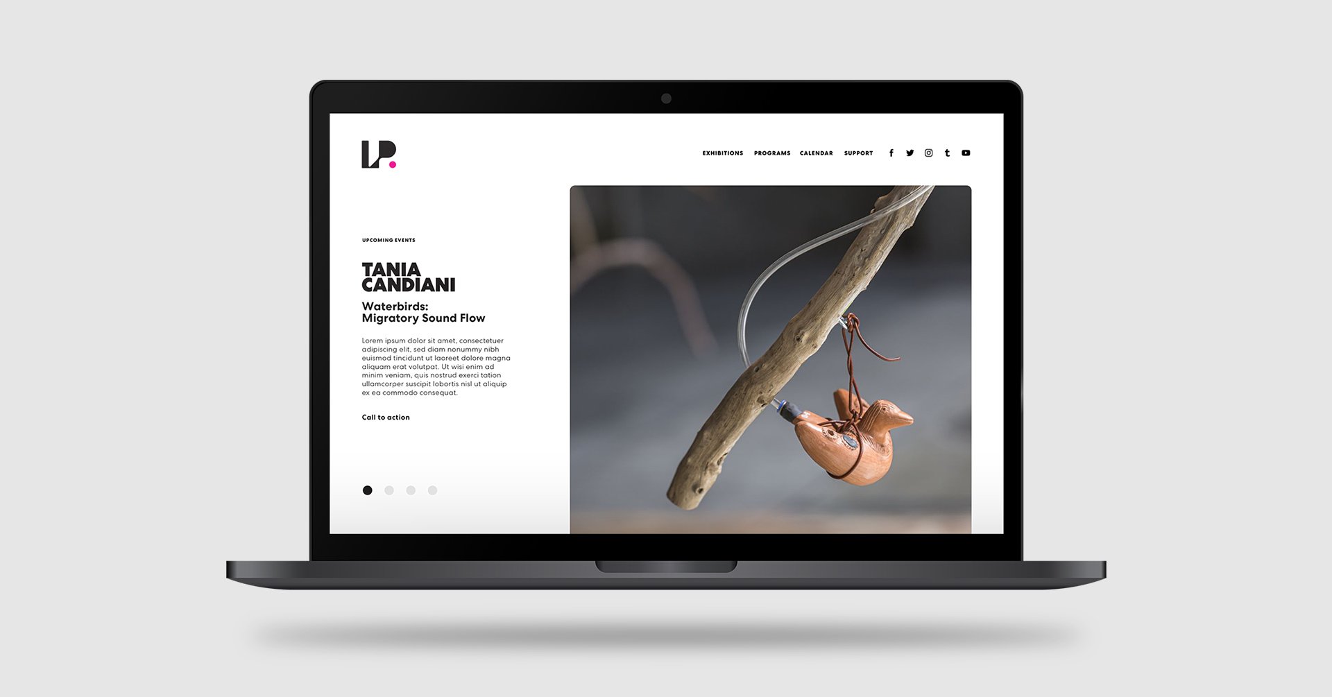
The focal point of the new logo design was a stylized, fluid "LP" icon, symbolizing the organization's dynamic and alternative approach to art. This dramatic and memorable icon was complemented by a sleek sans-serif nameplate, embodying Locust Projects' modern and progressive ethos.
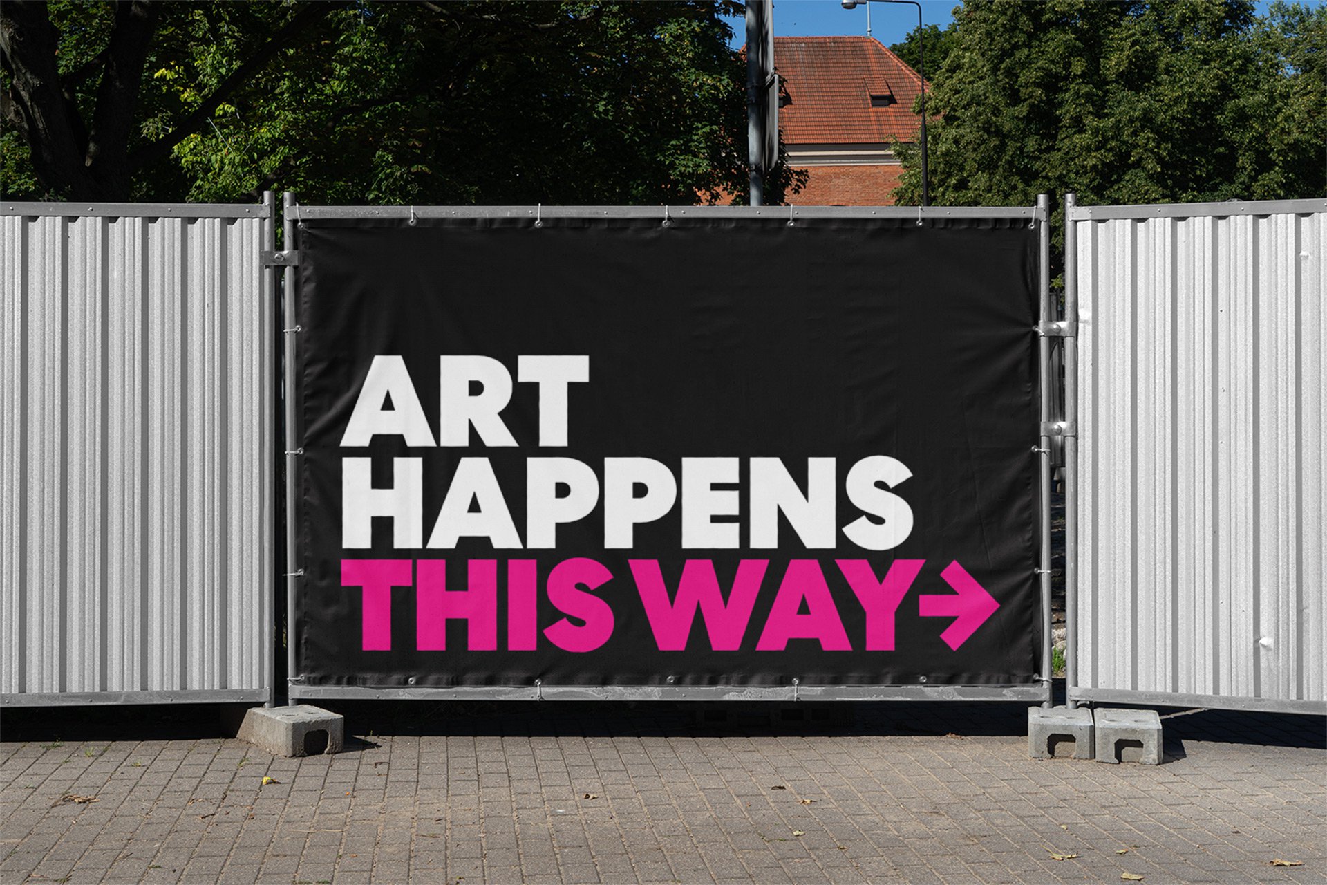
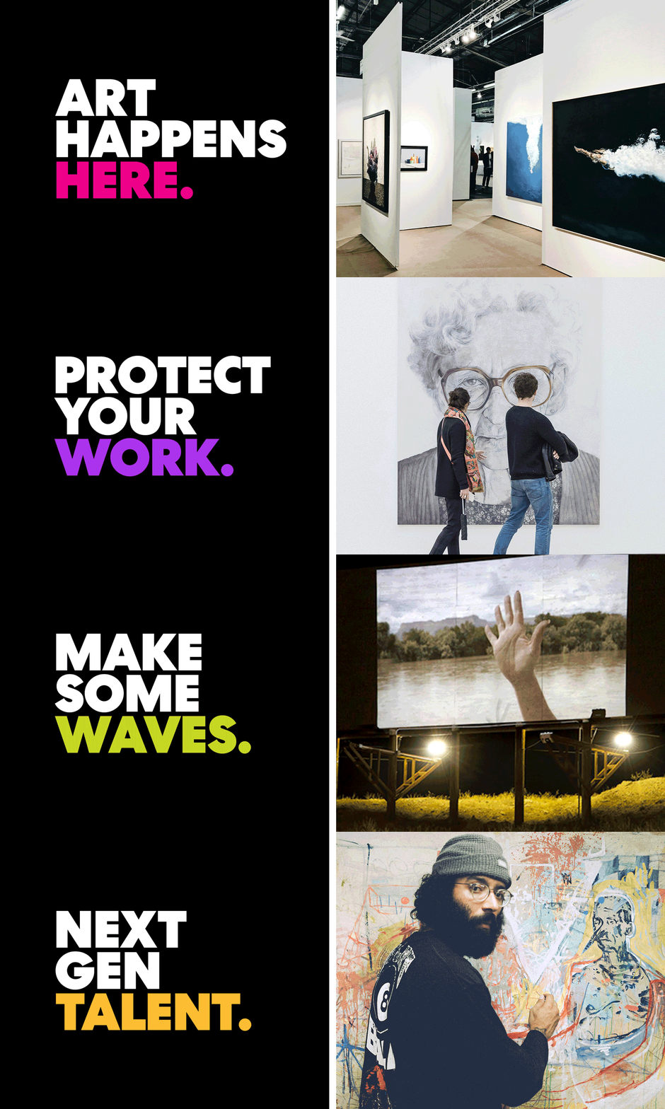
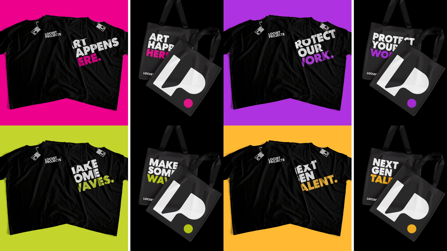
In addition to the iconic "LP" symbol, the logo dramatically "shouts" the tagline Art Happens Here in all caps, encapsulating Locust Projects' role as a catalyst for artistic expression and exploration. The bold typographic design and iconic "LP" symbol was embraced enthusiastically by the organization and the public.
Project included:
• Logo design
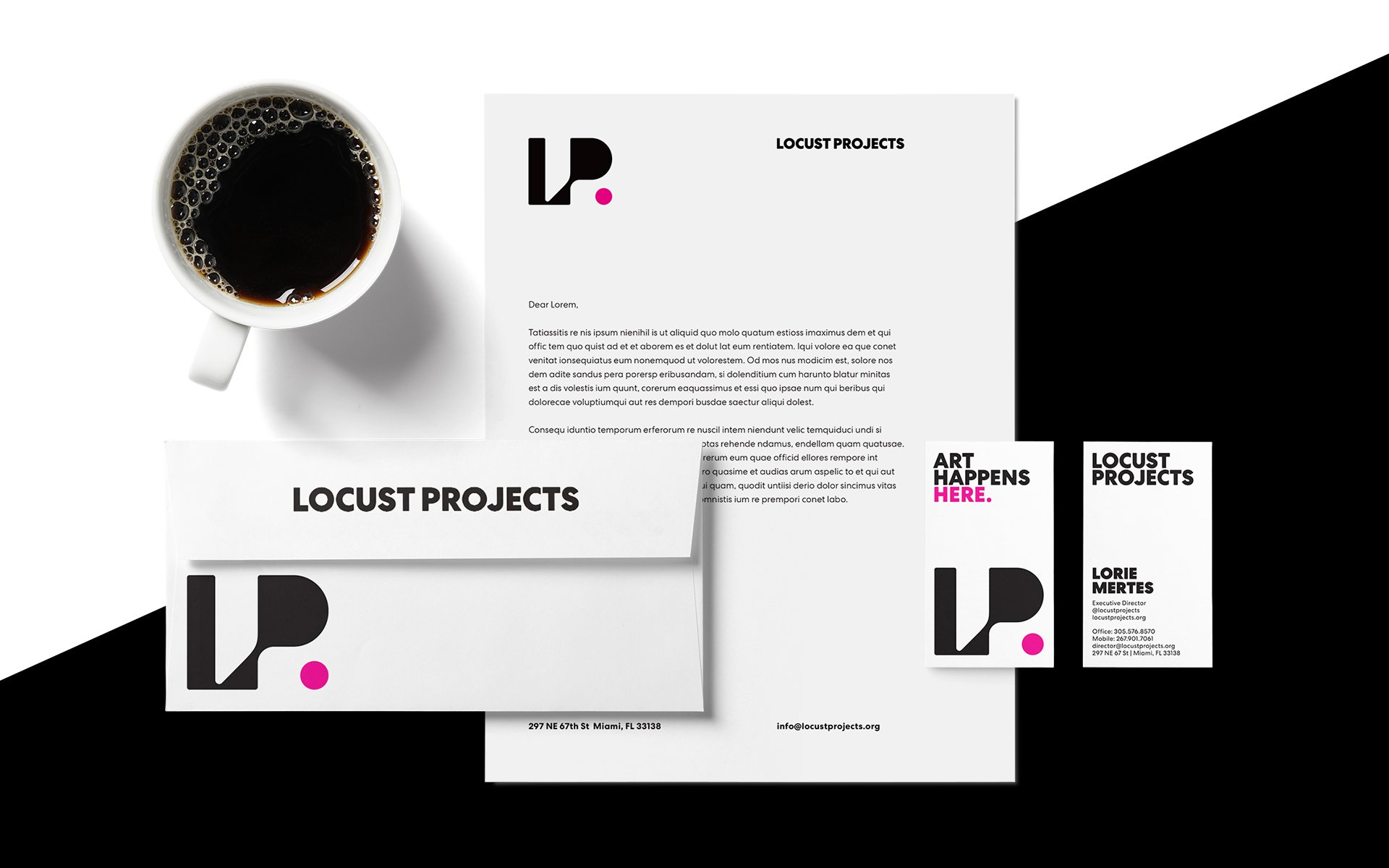
• Supporting collateral, letterhead, business cards, apparel, signage, marketing
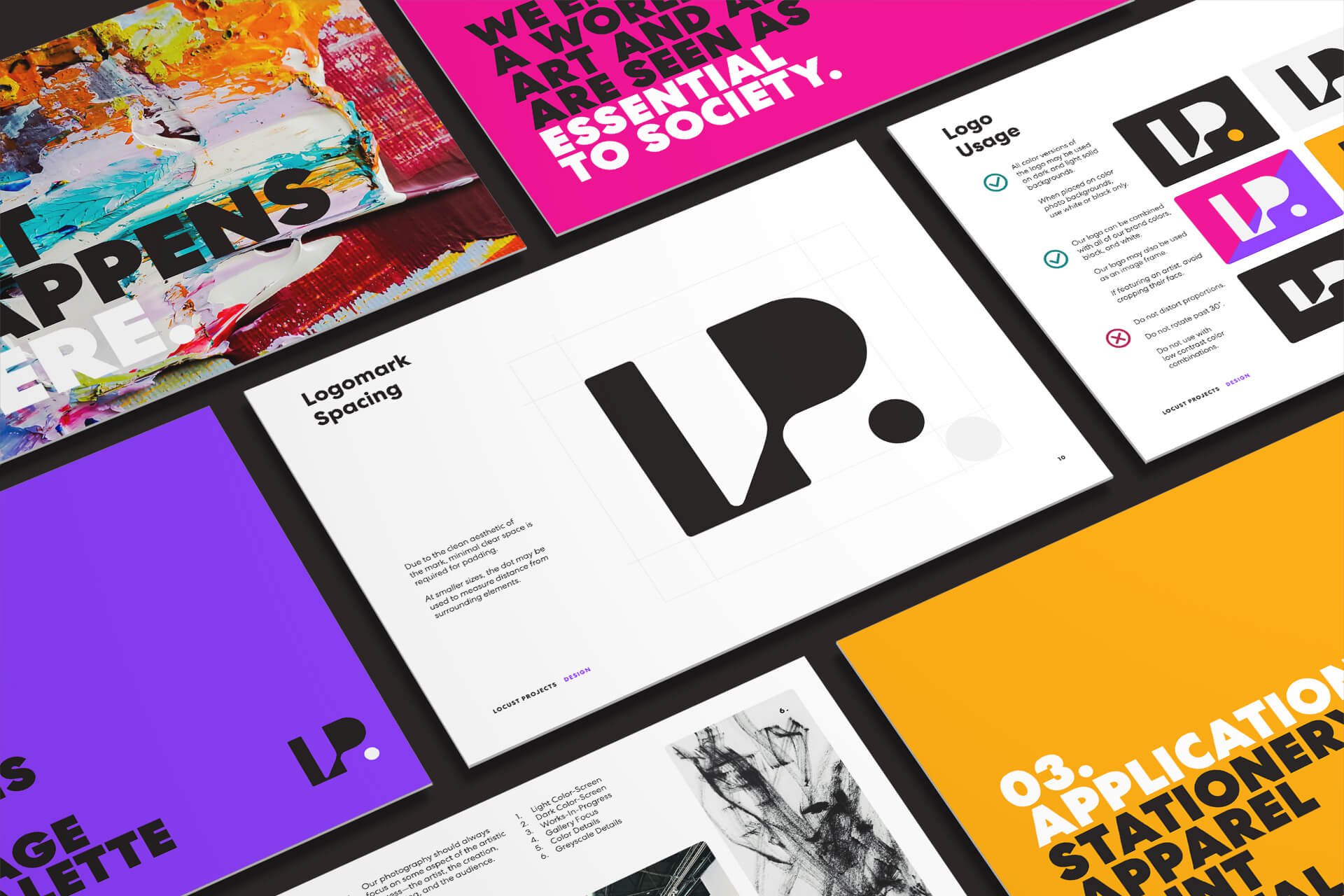
• Style guide
