

Branding / Logo Design
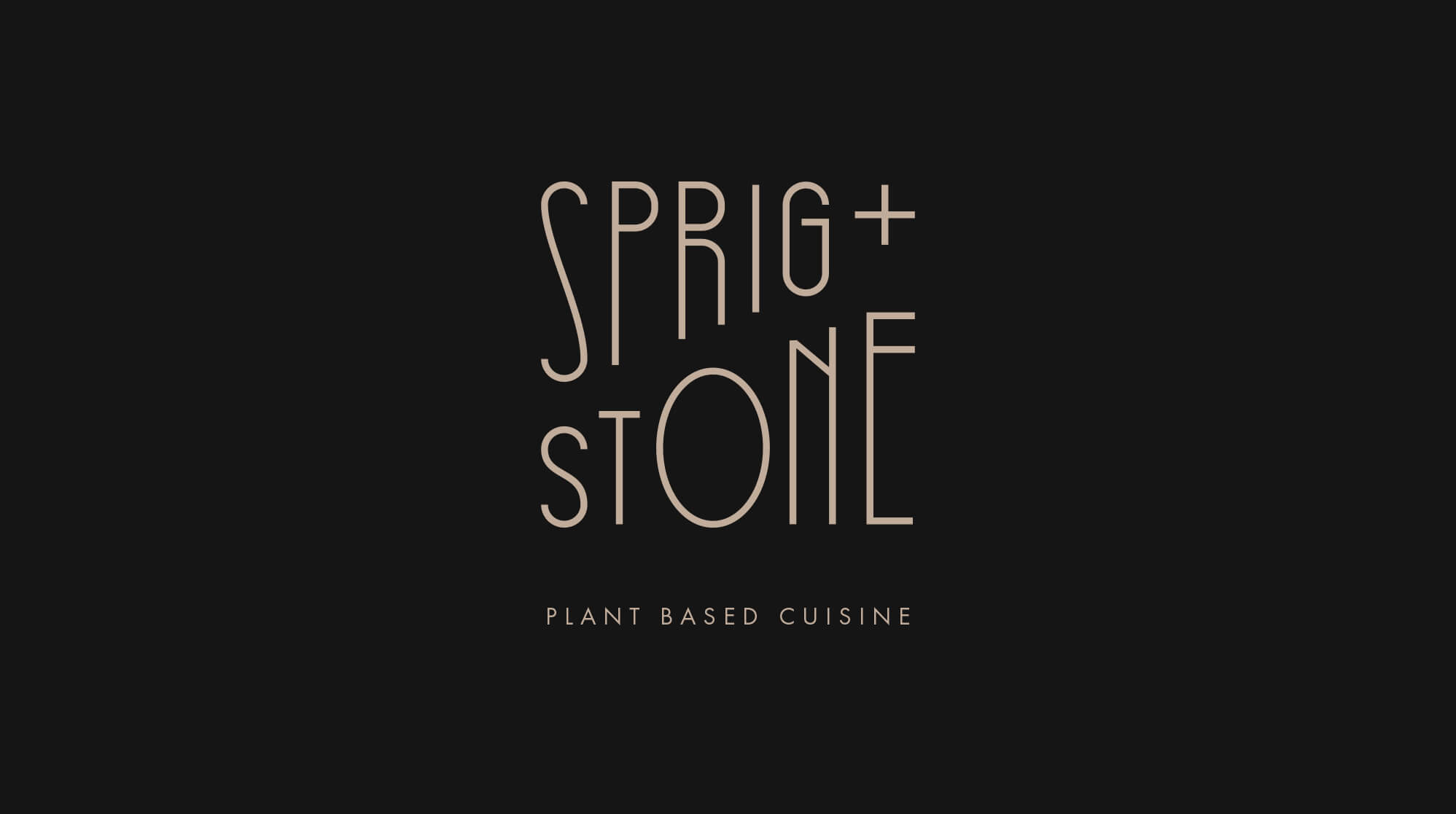
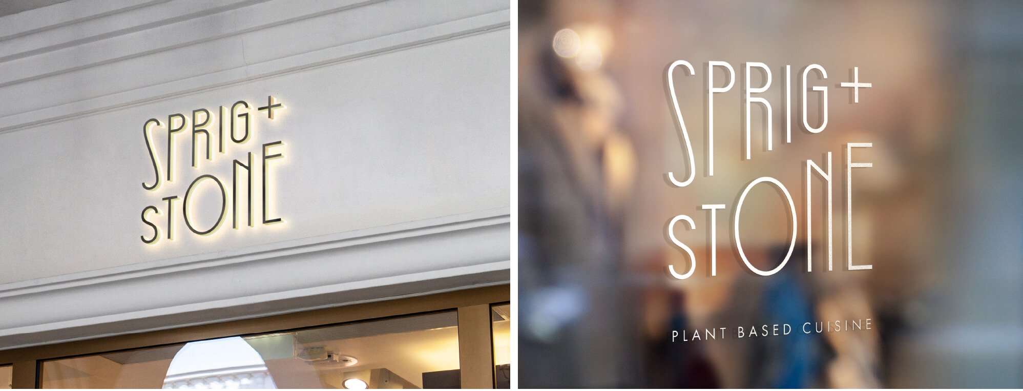
Plant-based cuisine is au courant these days (and healthier for our bodies and the planet to boot), so we were pleased when New York's about-to-open Italian-inspired Sprig + Stone restaurant came to us for their first logo and branding strategies. They needed to stand out from the pack of growing vegan and vegetarian options with their fast casual approach, and we had just the solutions.
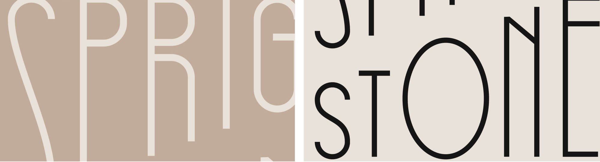
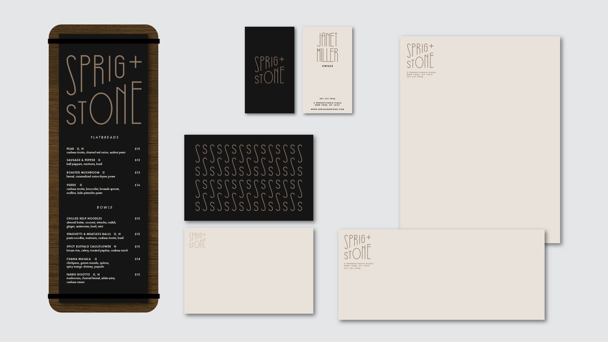
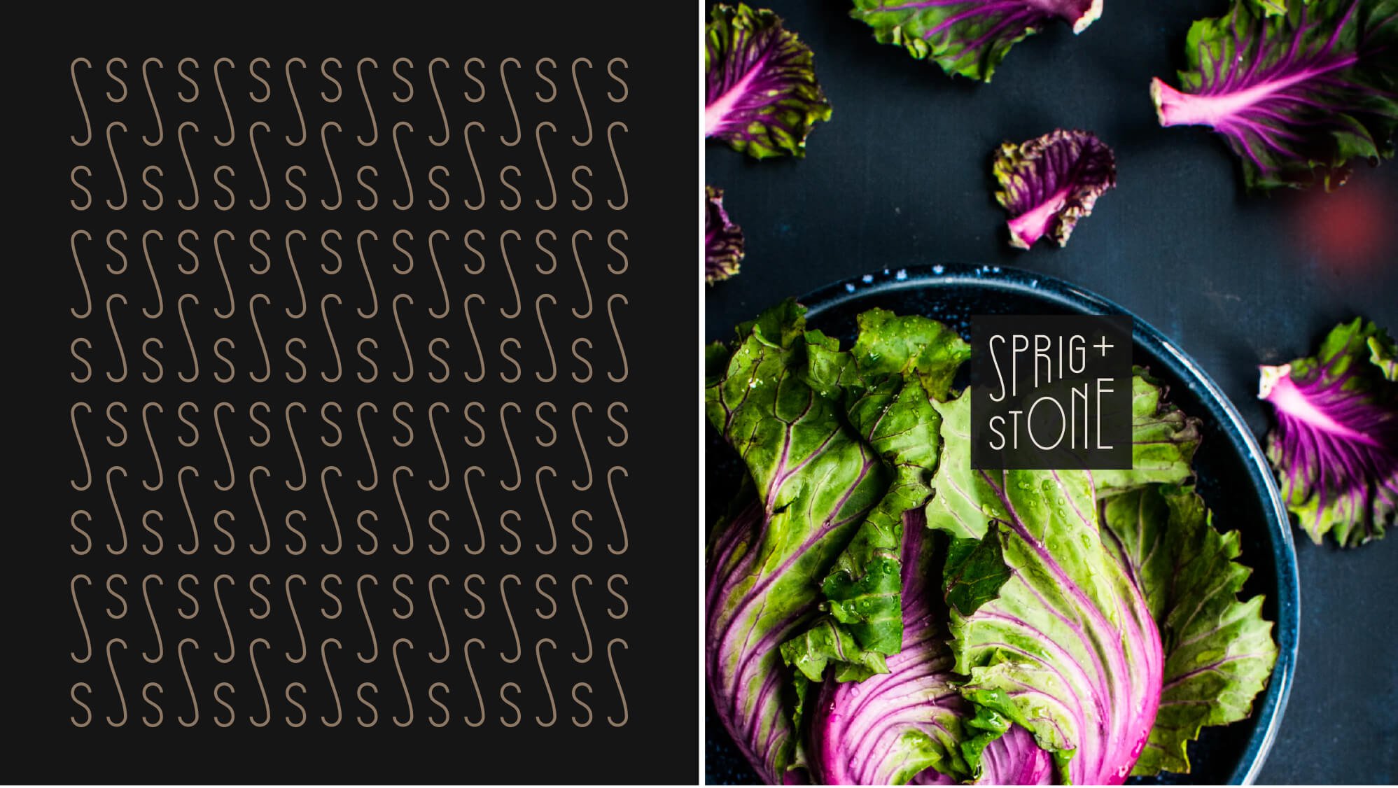
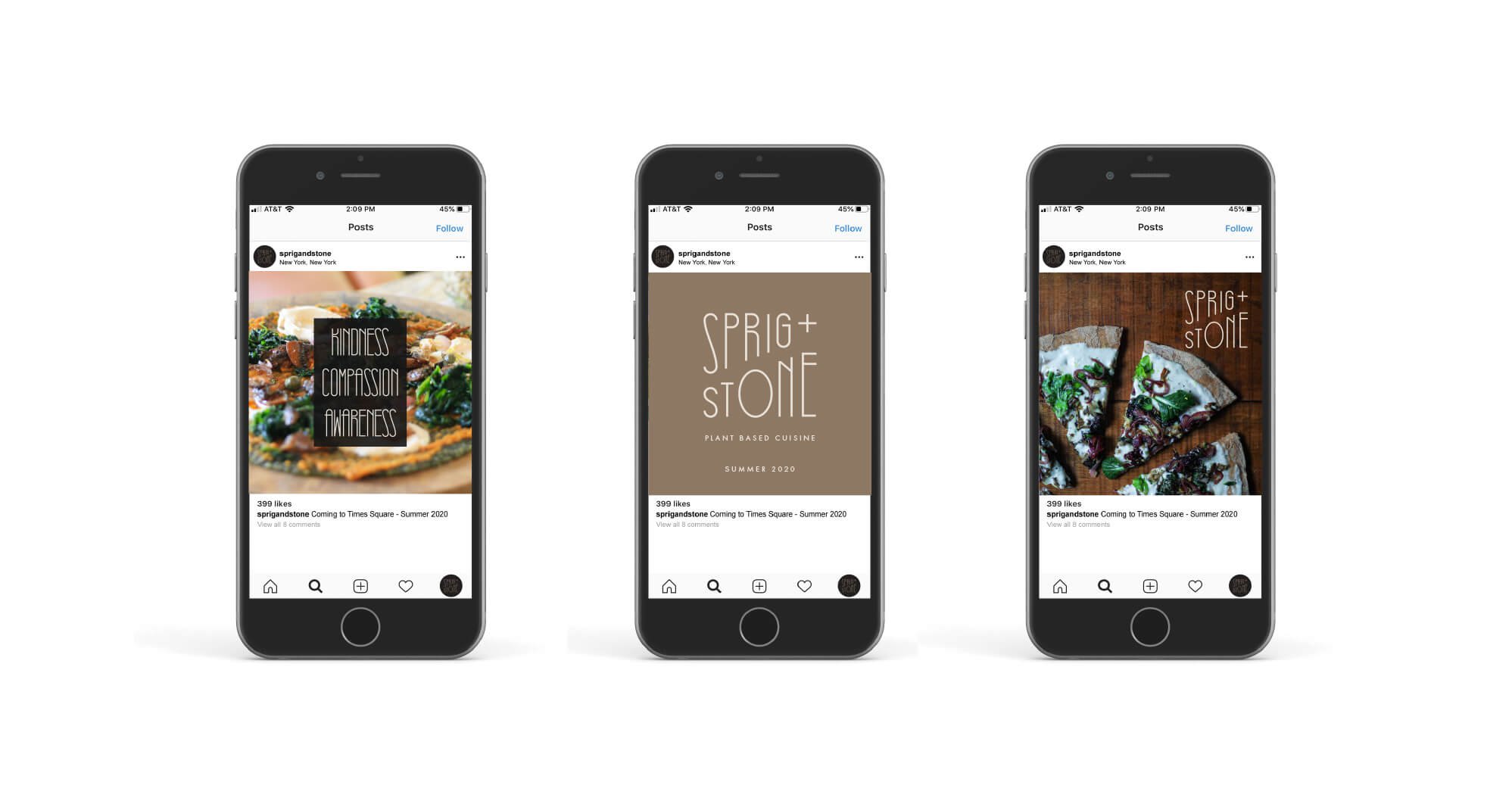
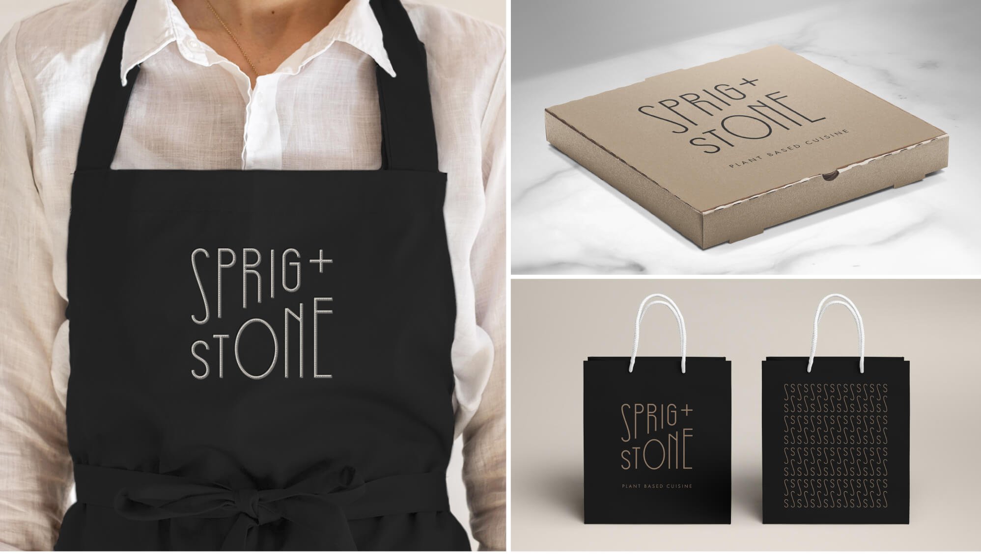
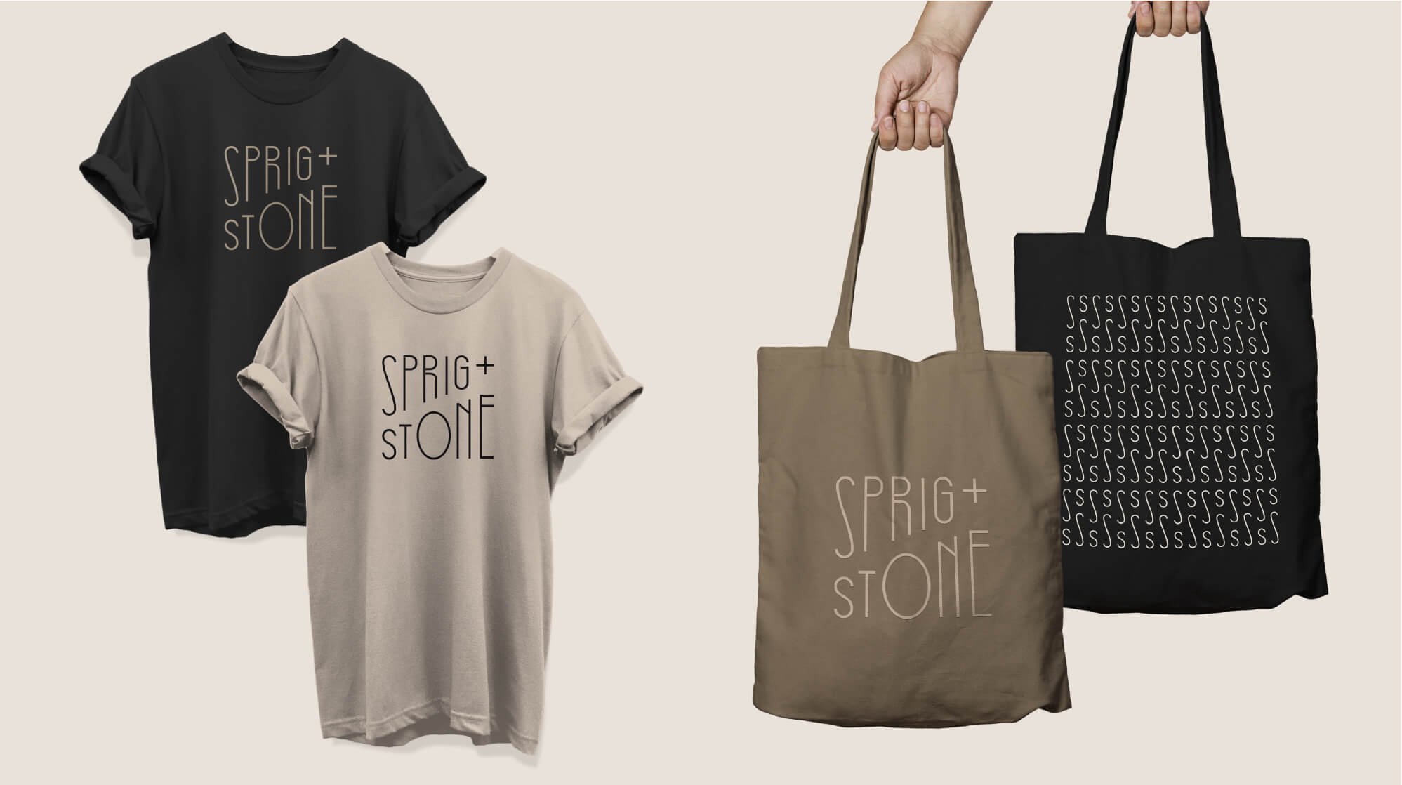
Our concept was to create a look and brand feel that was both modern and hip, but also accessible and down to (mother) earth. The logo includes a custom, light, almost nouveau san serif font. The two words of the name are stacked and arrayed with a rising slope that evokes the leading edge nature of a plant-based diet. The two initial "S" letters can also be used independently to create a more abstract design that works great on assets like totes and stationary. The stylish color scheme too is an earth or "stone" palette that leans into the concept.
Scope
Branding strategy
Logo design
Supporting collateral, including packaging, letterhead, business cards, apparel, signage, marketing
Style guide
 Plaza Construction
