As a top-tier
branding agency based in Miami, Jacober Creative was tasked with refreshing SSP’s visual identity to be smarter, sharper, and future-forward.
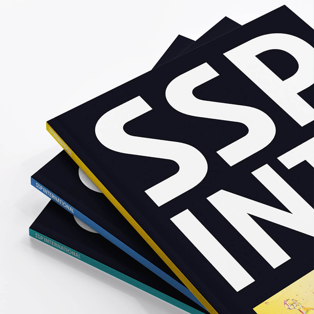
The Brief: A New Identity for SSP International
Graphic Design Studio Meets Science Education
SSP was evolving. The parent organization was being rebranded as SSP International, and they needed a new logo, brand messaging and visual system that would speak to everyone from Gen Z students to PhDs in the field. They also asked us to refresh the logo for their well-established summer program.
We dug in like the design nerds we are.
Research First, Always
Brand Strategy Rooted in Community Insight
As a strategic
Miami marketing and design studio, we started with deep stakeholder engagement – surveys and interviews with board members, faculty, staff and alumni. What did they want in a new brand identity? A design that felt contemporary and welcoming, while still capturing the rigor of real science.
Challenge accepted.
The Logo: Smart, Simple, and Seriously Cool
Award-Winning Logo Design That Sparks Discovery
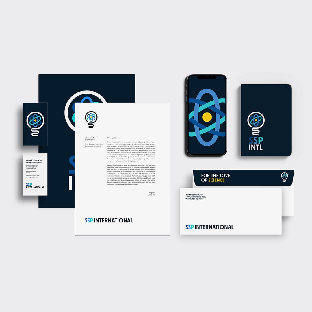
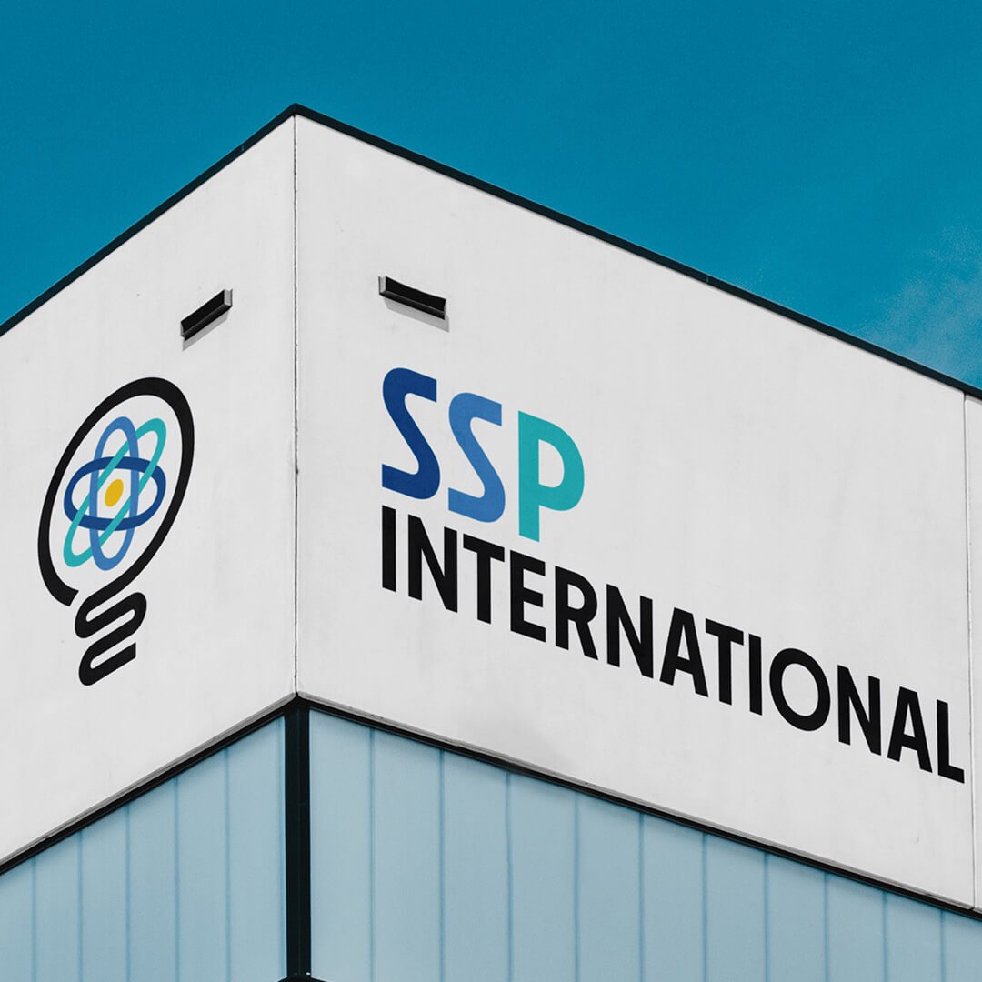
The final logo we created combines a sleek lightbulb outline, symbolizing the spark of insight, with the stylized orbit of an atom, the building block of everything. It's timeless, scientific and redolent of symbolic power. The single bold line, modern geometry and minimalist energy all reflect what SSP is about: curiosity, precision and progress.
Color-wise, we kept things grounded in nature – blues, greens and a pop of yellow. The concept was friendly and energetic, but still grounded. The custom typography (Neighbor Bold) adds a clean, confident tone that adapts across formats: digital, print, swag, signage and more.

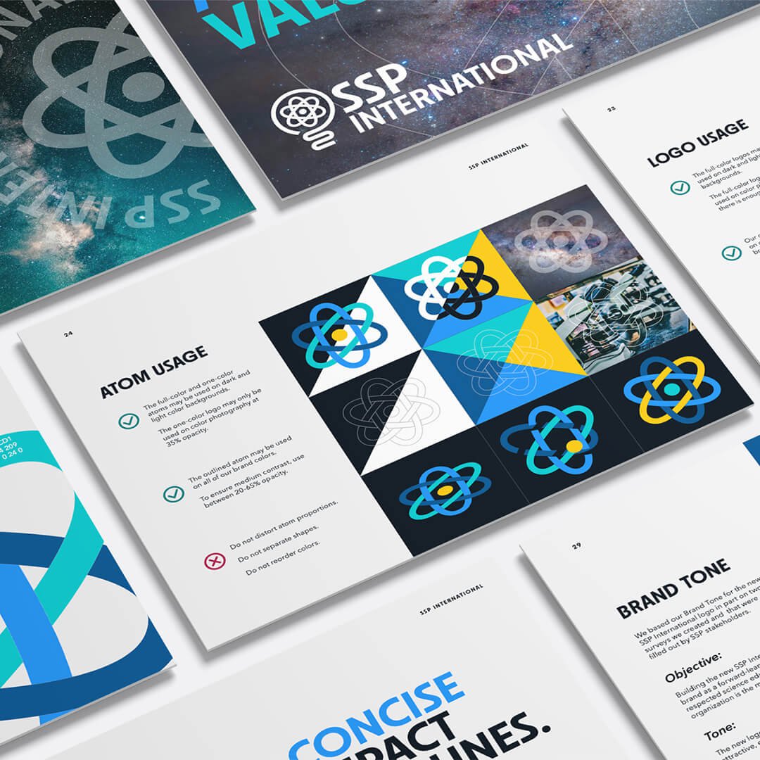
More Than a Logo: A Whole New System
Miami Content Creation, Collateral Design and Brand Guidelines
We didn’t just stop at the logo. We helped SSP bring their new identity to life across a whole range of marketing and communications materials:
• Branded stationery & business cards
• Apparel & signage
• Tagline development
• A full Brand Book & Guidelines to ensure consistency across platforms
Our team worked collaboratively to build out a 360-degree brand experience, ensuring visual and verbal cohesion across every touchpoint.
Why It Matters
Miami Marketing + PR Strategy That Builds Long-Term Value
By fusing design strategy with brand storytelling we helped SSP own their space as a global leader in STEM education. The brand now works harder, across their website, social media, admissions materials and more, to inspire the next wave of Einsteins, Curies and Galileos.

Ready to Build a Brand That Means Something?
Work With an Award-Winning Miami Design and Branding Studio
If you’re searching for a branding agency in Miami that knows how to combine creative design, content creation and marketing strategy, you’ve found us. Whether you're rebranding, launching or leveling up, we’re here to help.
Let’s create something that lights up the universe. Reach out to us today [Contact Us].