Even
The New York Times recently declared bananas the flavor of the moment, popping up everywhere from cafés to cocktails to desserts. Apparently, the world's favorite fruit is having a career revival (just like
Jennifer Coolidge, and dare we say,
Madonna).
And we're really into it. Not because it's trendy but because bananas have always been flaming, a perfect complement to a world on fire.
Think
Carmen Miranda. Think
Andy Warhol. Think
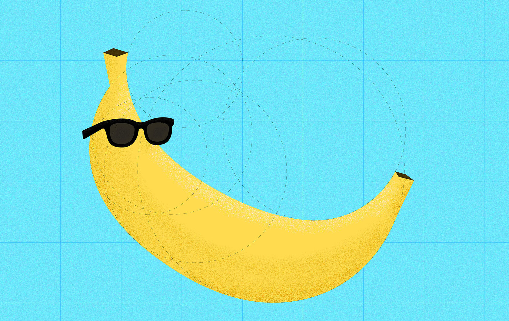
Art Basel banana-Gate. Ah...the humble banana peel, arguably history's most successful visual metaphor. Few fruits have managed to become a pop culture icon and a design motif. At Jacober Creative, we go ape for that kind of range.
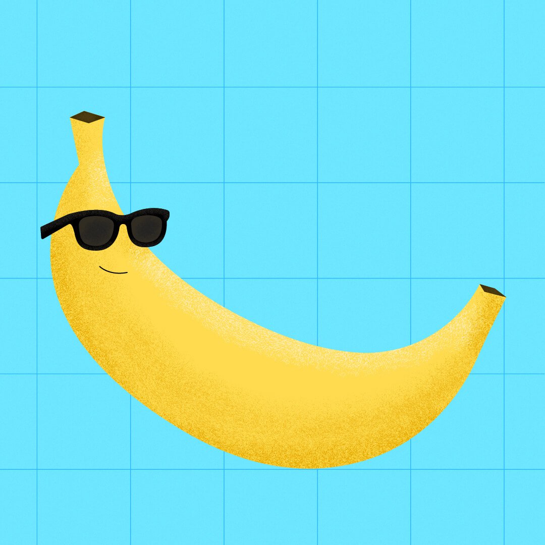
Three things bananas remind us about great design:
1. Be recognizable.
A banana silhouette works at ten feet or ten pixels. Great brands do the same.
2. Embrace color.
Yellow isn't shy. Neither are the best identities. Color should make people feel something before they read a single word (and respectful nod to all those rainbow-hued heirloom bananas too),
3. Don't take yourself too seriously.
The world has enough people yelling and ruining our collective days. Good design doesn't have to. Sometimes a little wit or a cheeky turn-of-phrase give you more mileage than just another opinion.
These days, everyone seems to be choosing sides. On the job, we choose good typography, bold color, smart storytelling and the occasional oversized banana.
Call us old fashioned. Or potassium powered.
Either way, we'll keep making brands that are memorable without screaming (well, maybe sometimes), playful without being frivolous, and optimistic without pretending everything is perfect.
Now, if you'll excuse us, we've got a few brands that could use a little more (banana-powered)
appeal!