None
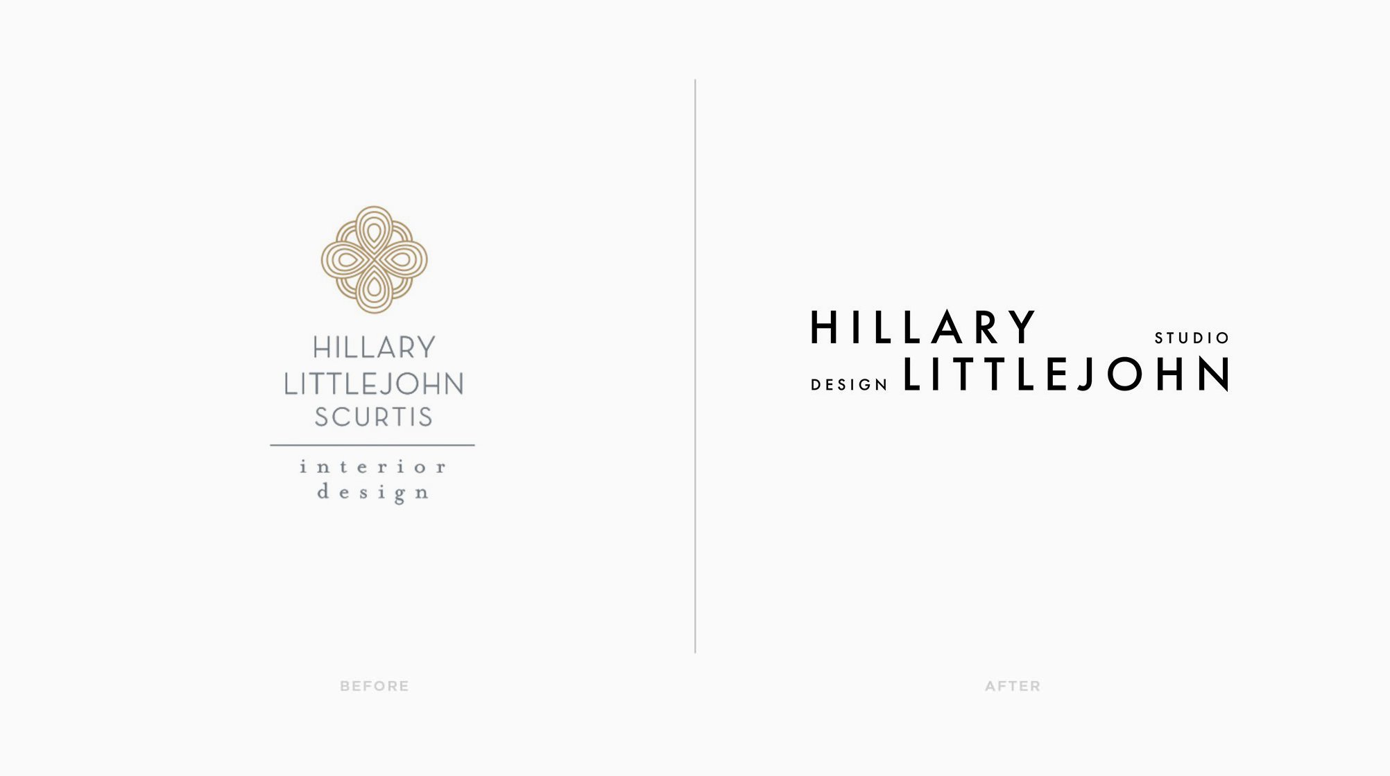
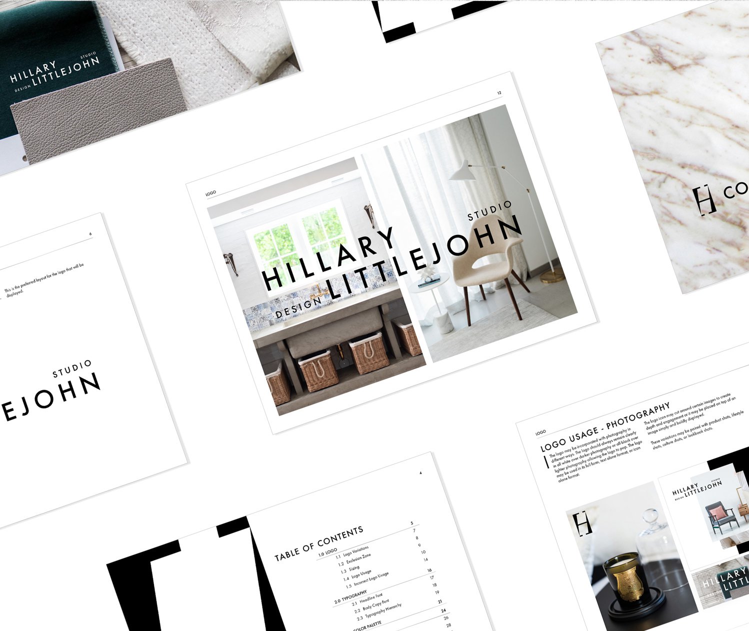
Dallas-based interior designer Hillary Little John wanted a rebrand to better reflect the evolution of her business. She felt that her original slightly shabby-chic logo needed to be replaced with something more bold & striking, yet simple and classic.
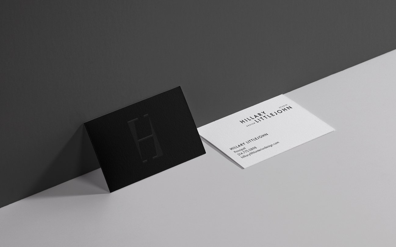
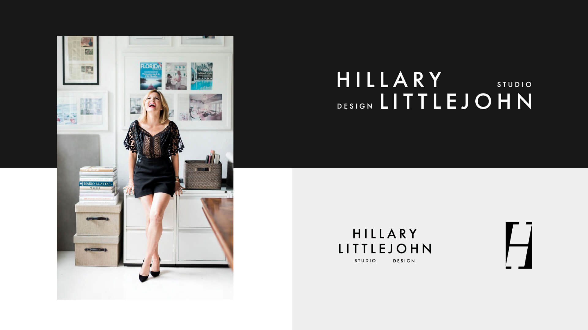
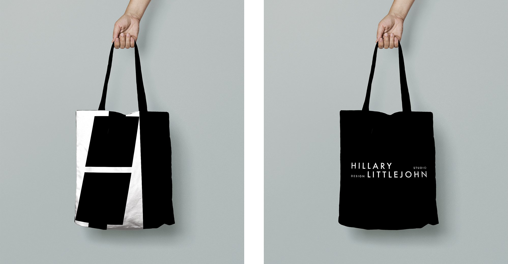
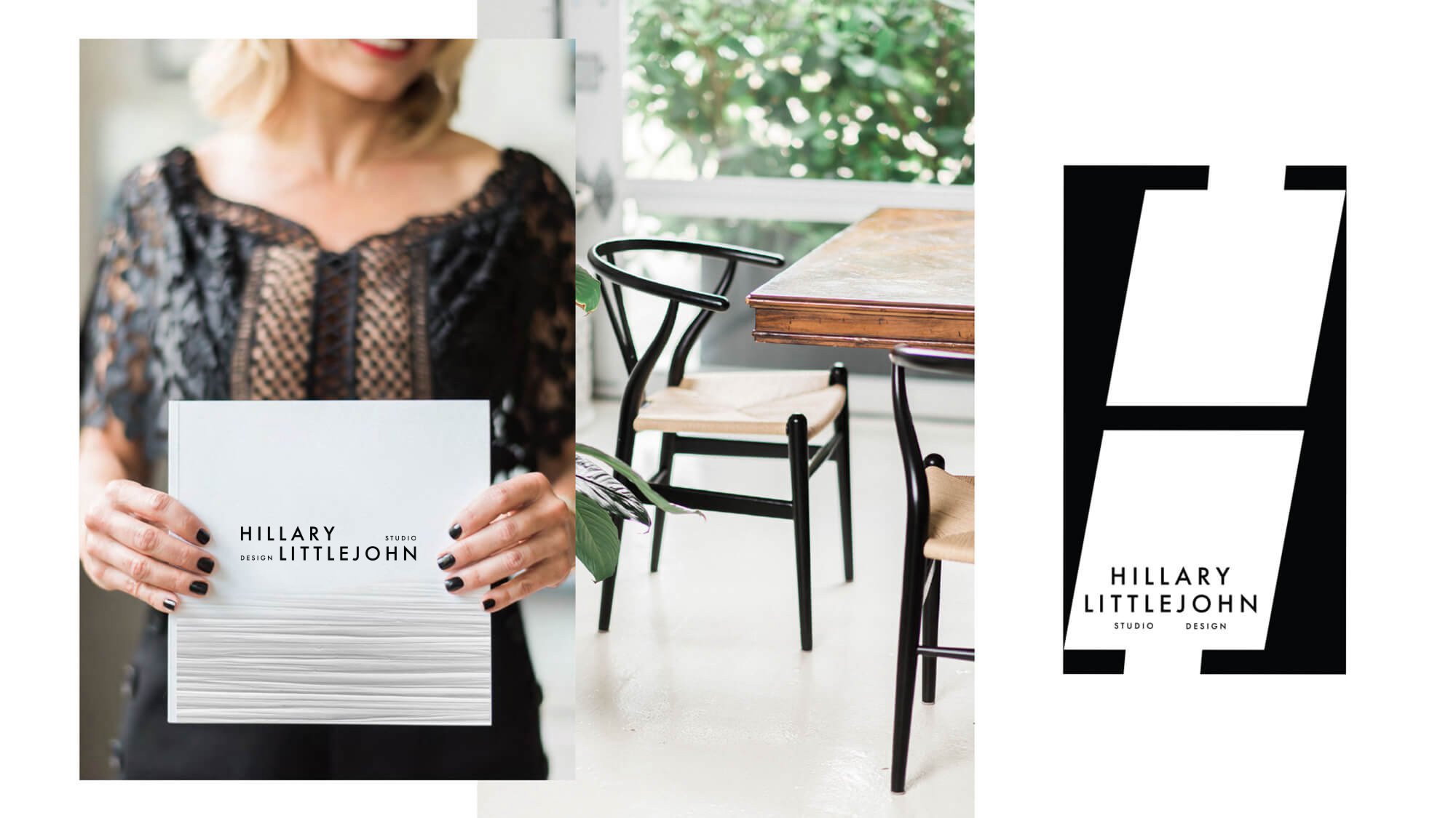
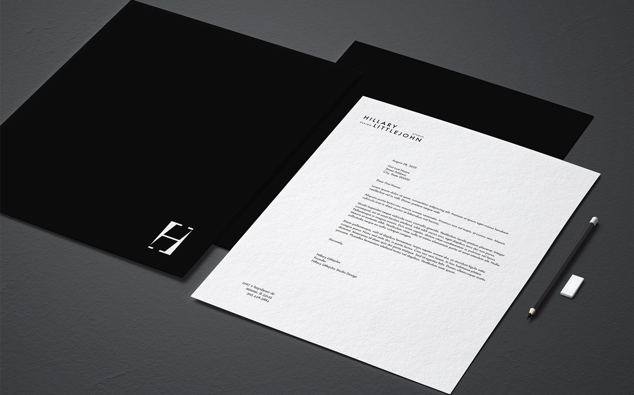
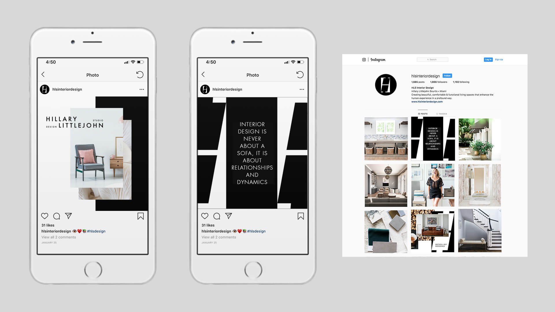
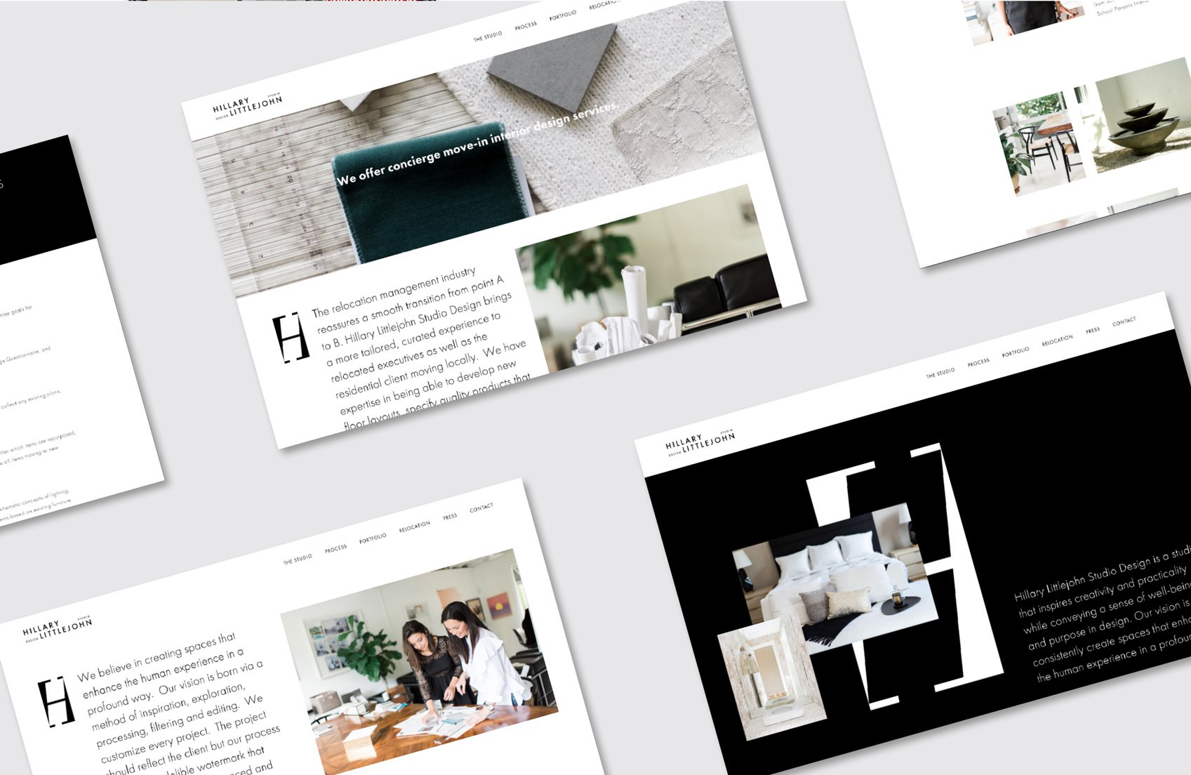
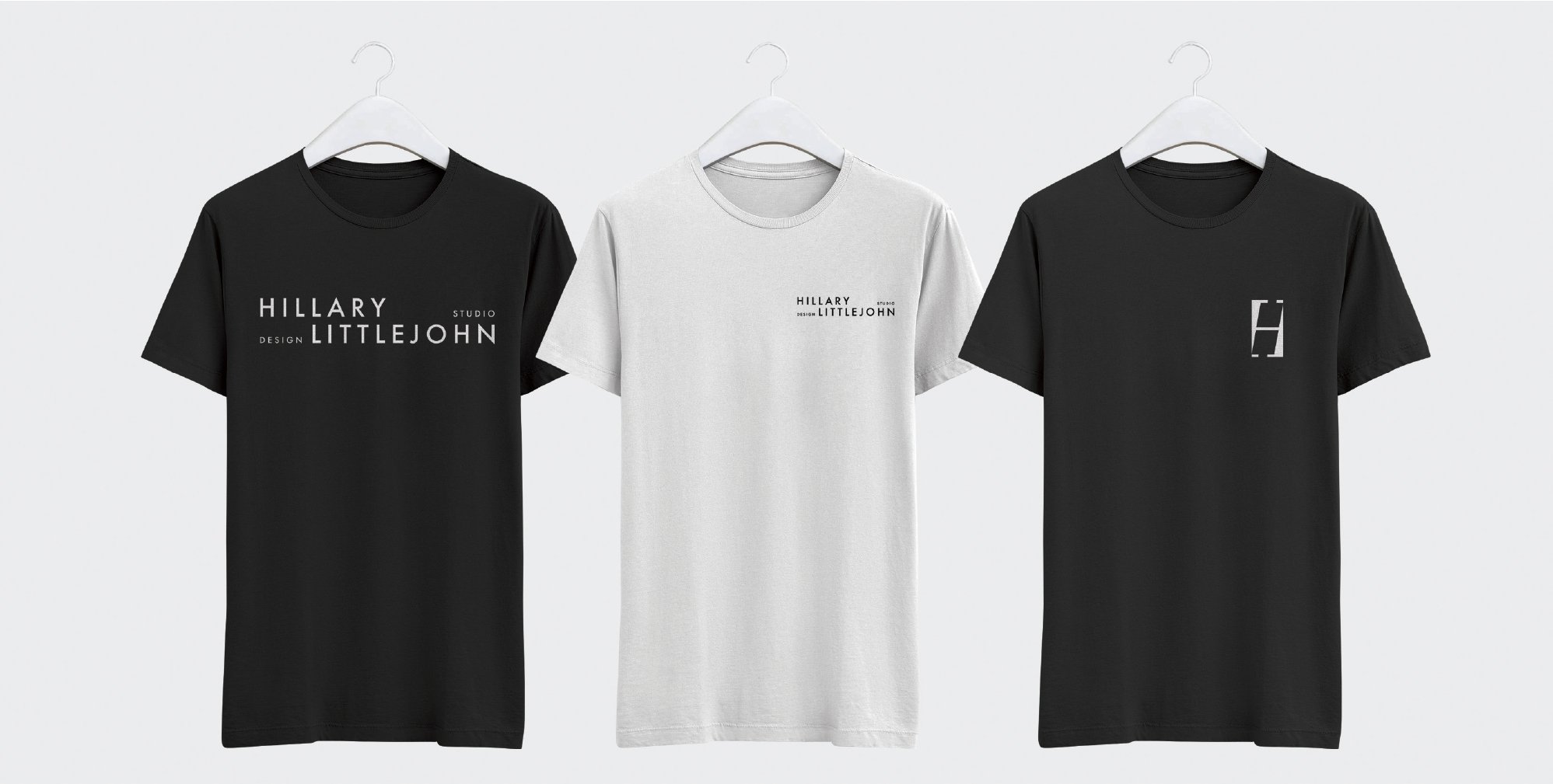
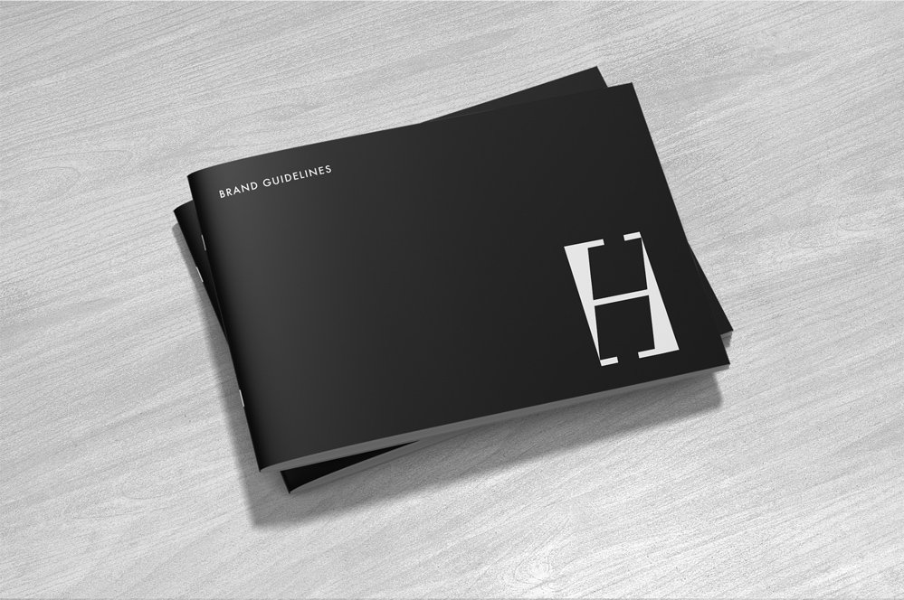
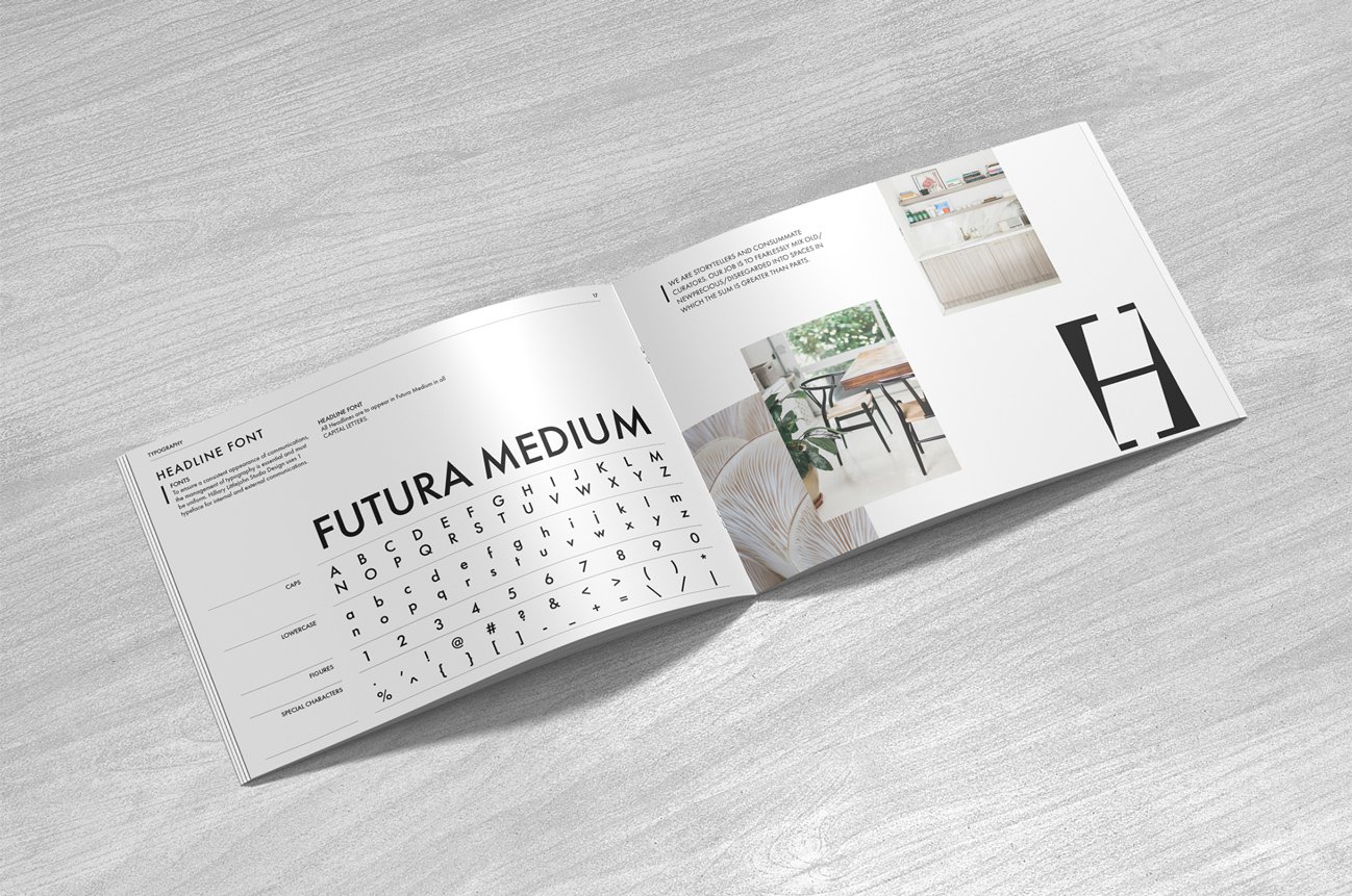
Hillary’s logo is inspired by fashion editorial, specifically Vogue and Harper’s Bazaar’s famous bold take on magazine typography. We wanted something that would be iconic for our client. The “H” icon is a derived from an italicized serif font that is visually cropped on the corners without impeding the readability while the nameplate is a tracked out sans serif font to provide balance and contrast. The branding is compelling and assertive, helping Hillary stand out from the competition and providing a complete 180 from her old branding. It makes a statement while letting her work speak for itself.
