Research, Logo, Tagline & Rebranding
What makes the universe tick? The young minds that the Summer Science Program nurtures with their forward-thinking educational opportunities want to know. They are a leader in educating teens with its intensive and immersive summer experiences set on college campuses. Jacober Creative was brought in to infuse a contemporary, welcoming look to their branding and logo design, one that would inspire and speak to their range of stakeholders.
They were rebranding the parent organization as SSP International and wanted a new logo and taglines that would bring it up to date, while being inclusive of their current high-level science programs. SSP also wanted us to refresh their current summer education logo.
In the onboarding and research phase, we surveyed a range of stakeholders, including staff, Board members, alums and teaching faculty, to assess what they might want in new branding. The conclusion was that a new logo for the SSP International brand needed to strike just the right balance between appealing to a younger-skewing demographic, while encompassing a serious approach to science in all its disciplines.
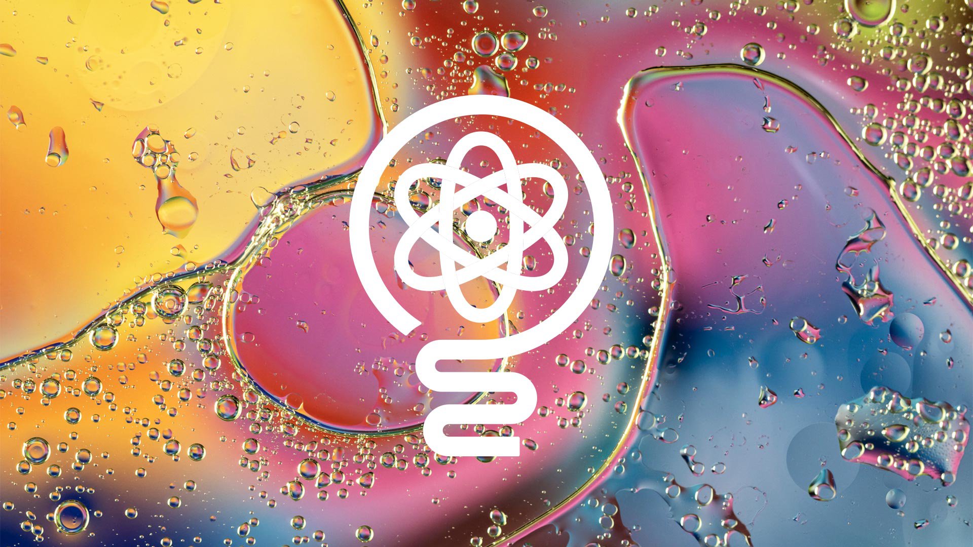
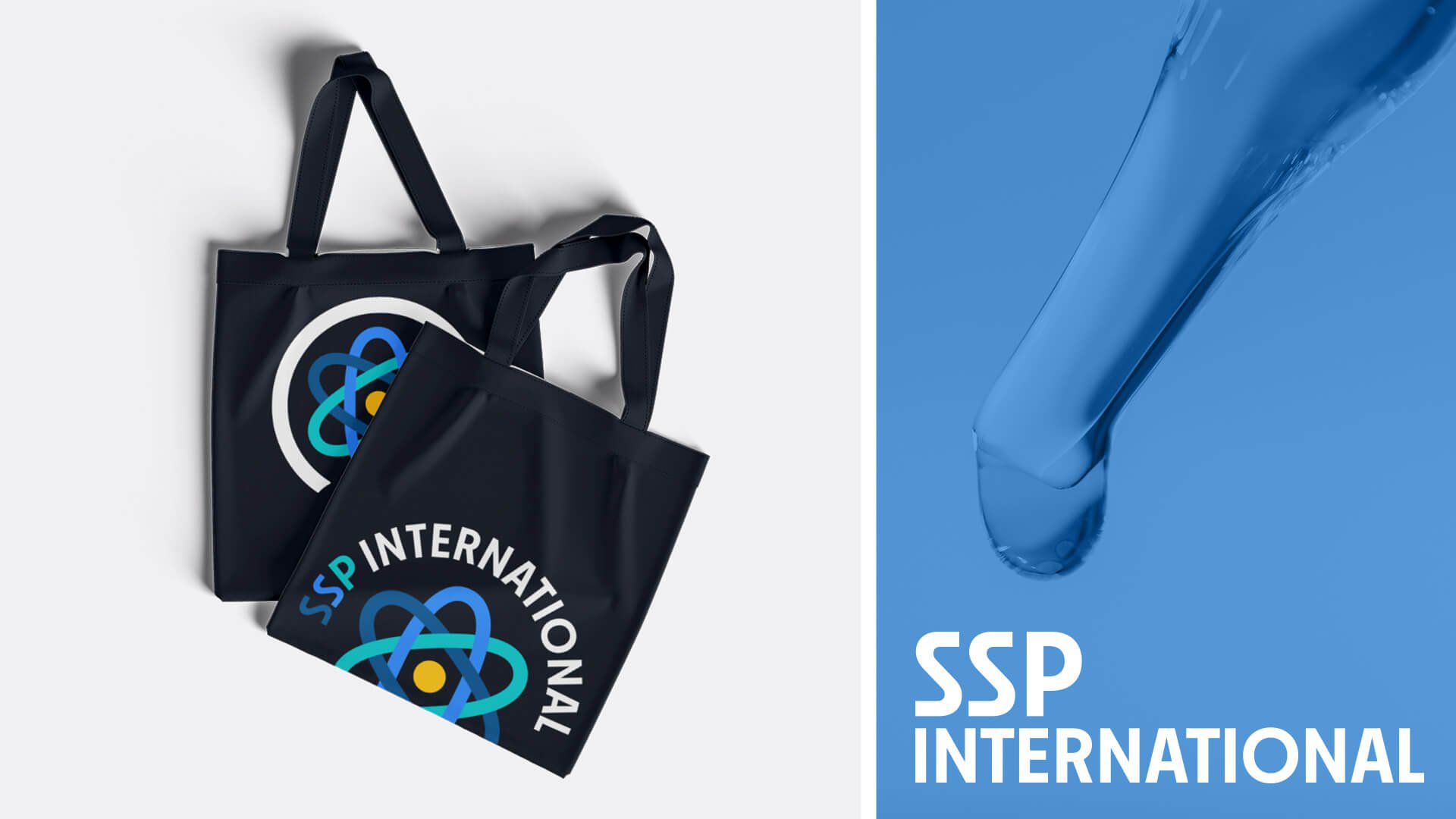
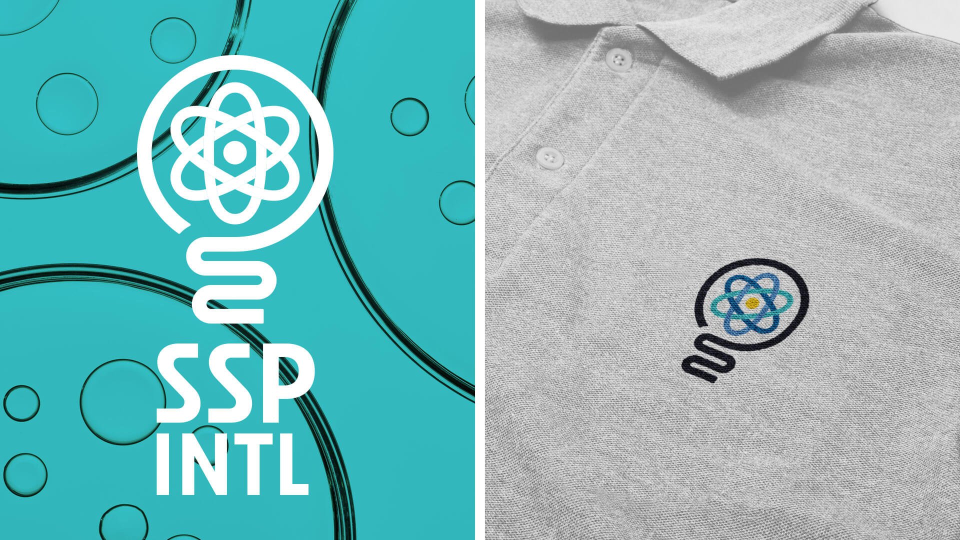
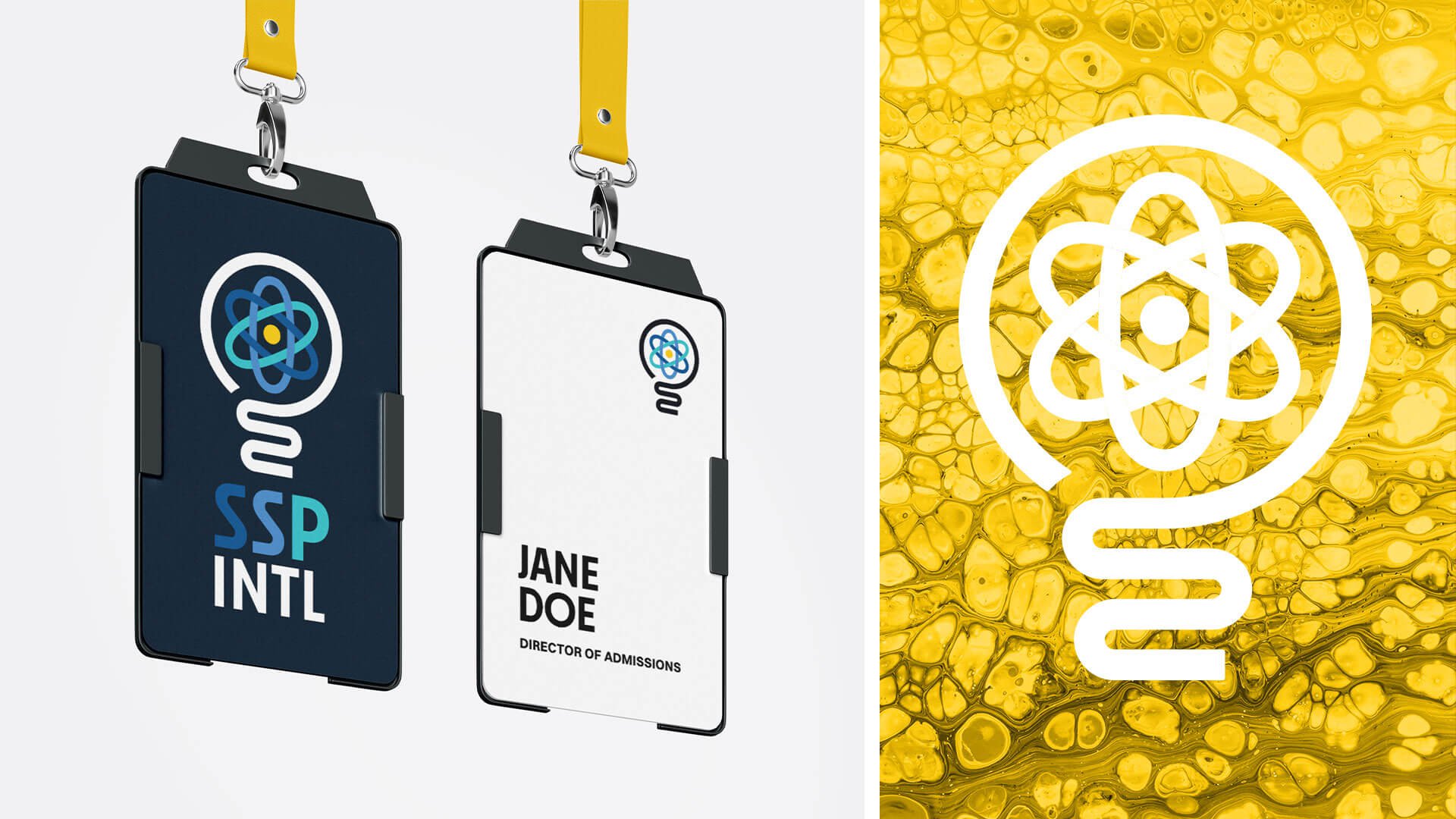
After many options were created and submitted, the final logo that was chosen marries a contemporary lightbulb icon with the stylized structure of an atom inside it. The lightbulb reflects the “aha” moment of scientific discovery, and the atom is of course the basic building block of the universe. The design blends the symbolic power of innovation with scientific precision. The lightbulb shape is outlined by a single, bold black line that transitions seamlessly from the sturdy base to the cylindrical top, and the structure of an atom adds a dynamic layer, representing energy, creativity, and the fusion of ideas. The icon has a timeless, minimalist appeal.
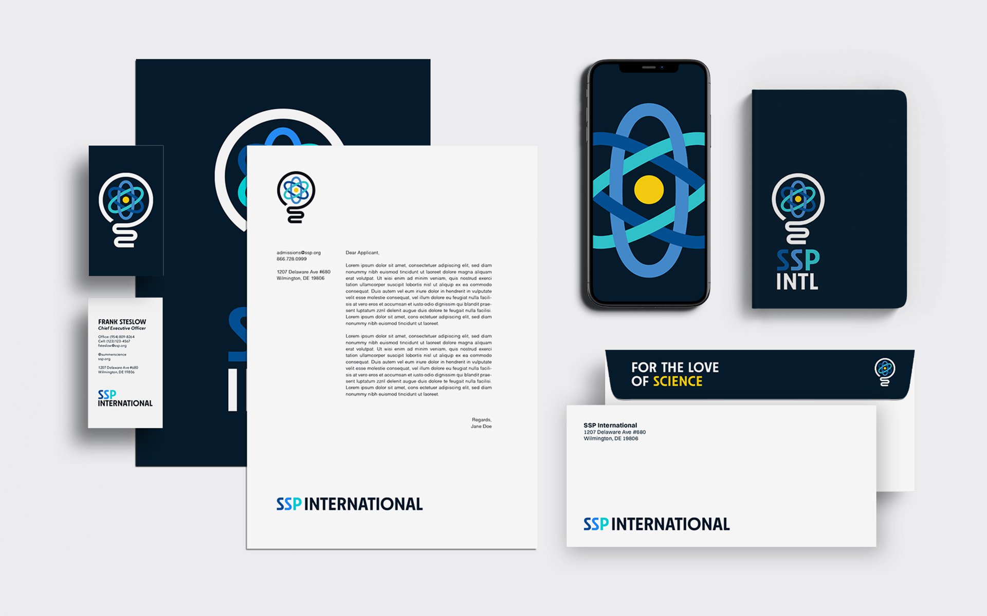
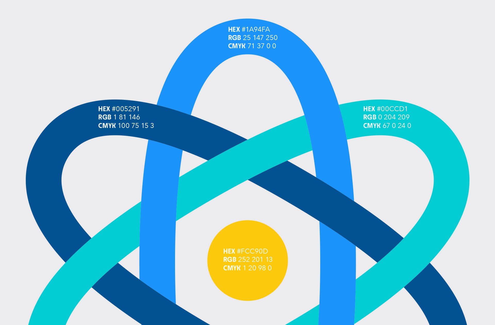
The colors are part of the palette that SSP was most interested in – blues and greens and a touch of yellow – that echoed the feel of the world of nature that much of science investigates. We used the Neighbor Bold typeface, a timeless sans serif, that is friendly and provides a wide range of ways that the full logo, as well as just the icon or just the type alone, could be applied, from stationary to apparel to advertising.
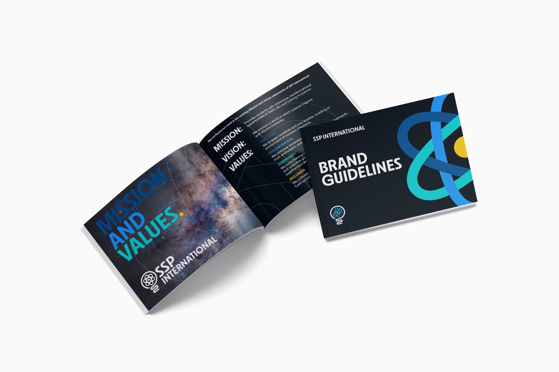
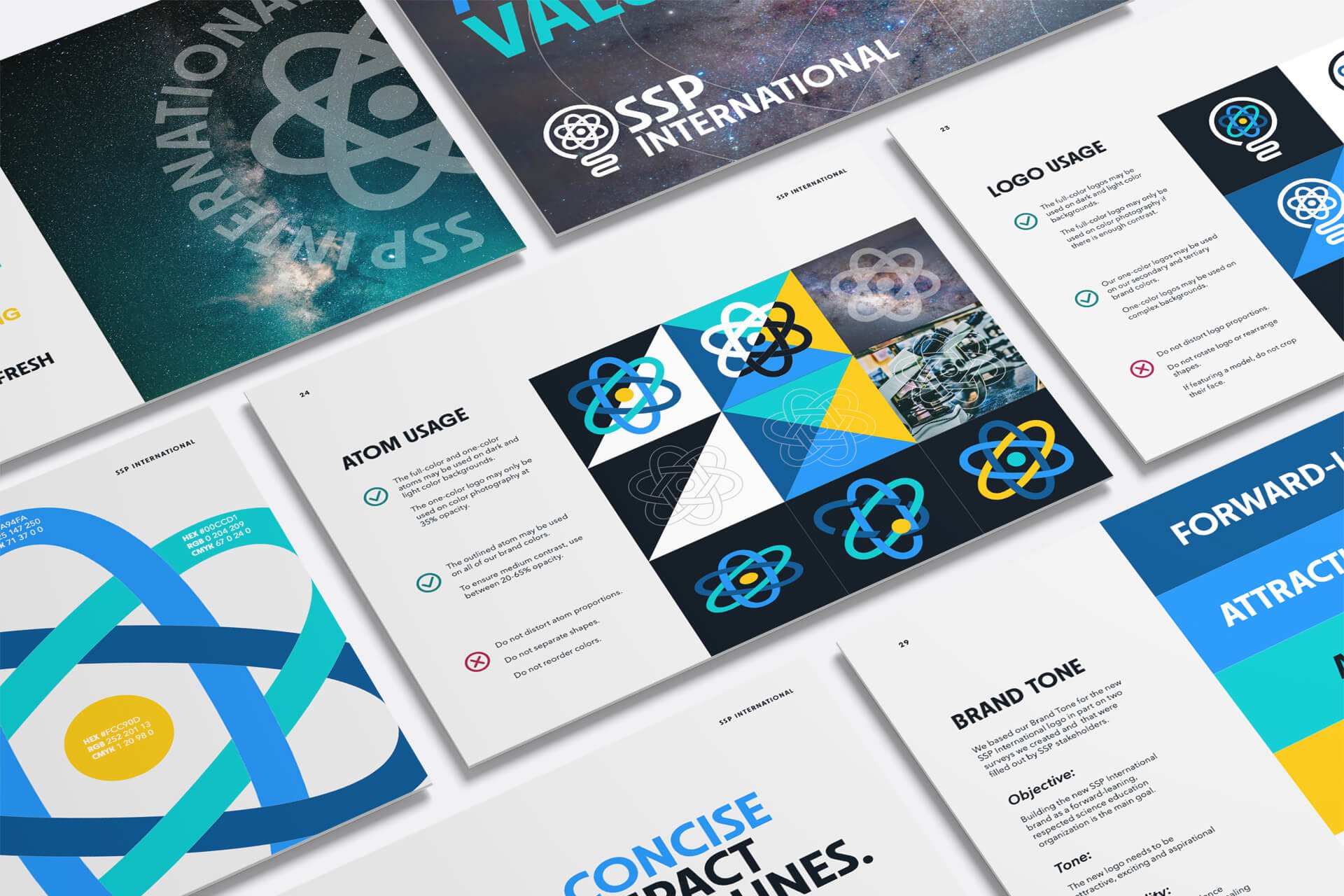
A Brand Book & Guideline was created to allow SSP to continue to use the logo for the foreseeable future in effective and creative ways.
When the next generation’s Einstein emerges, we will have played our part.
PROJECT INCLUDED:
• Research
• Logo design
• Tagline
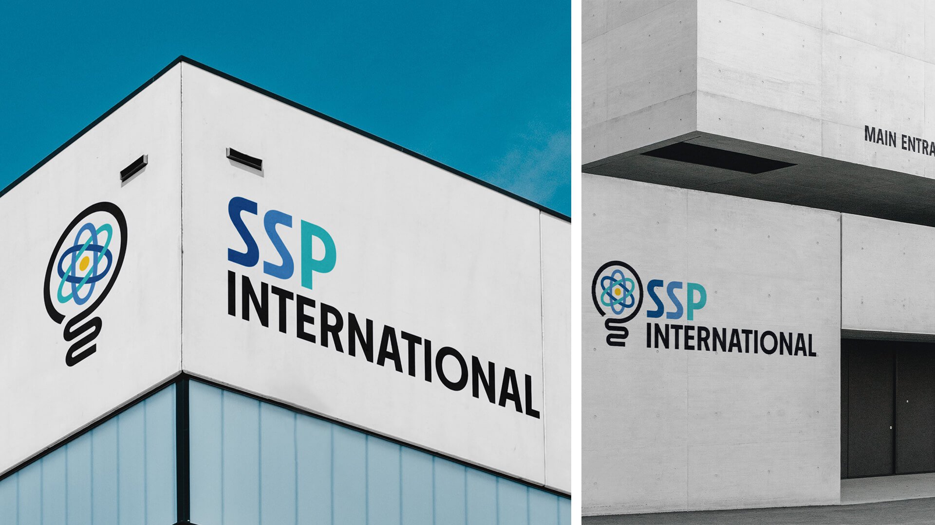
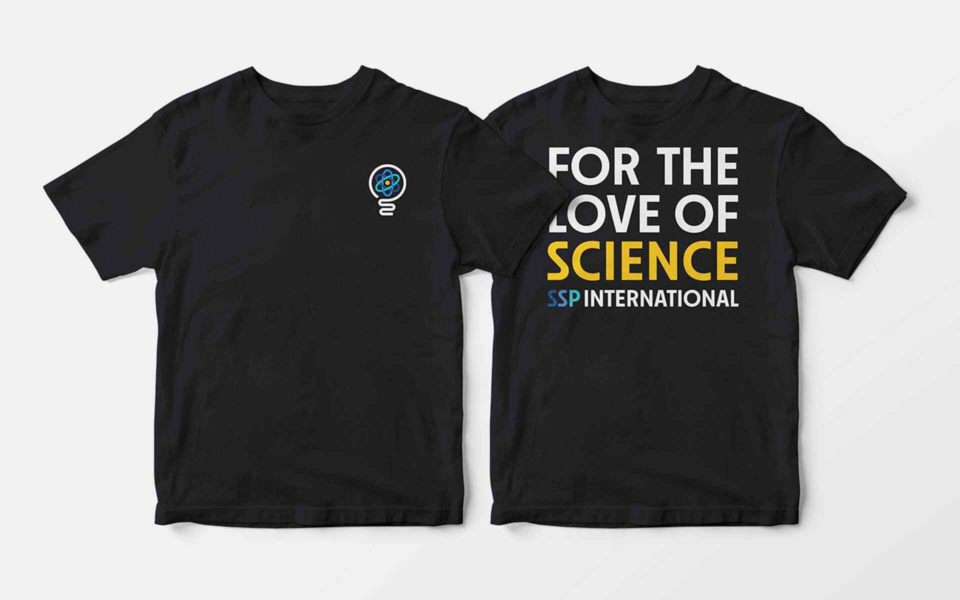
• Supporting collateral, letterhead, business cards, apparel, signage, marketing
• Brand guide
