Branding / Logo
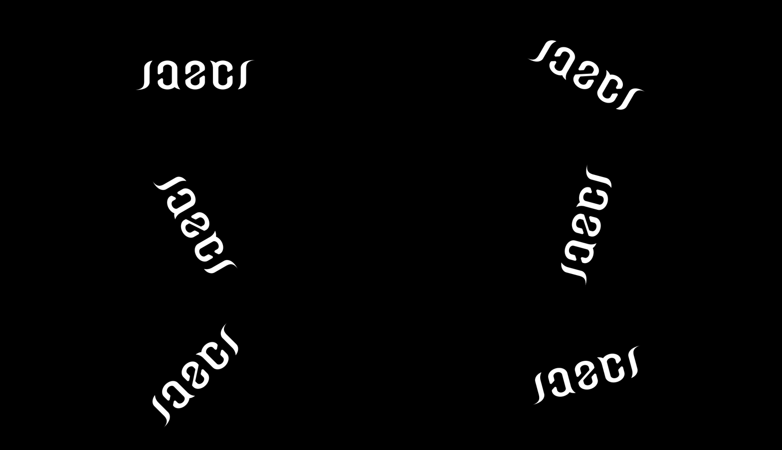
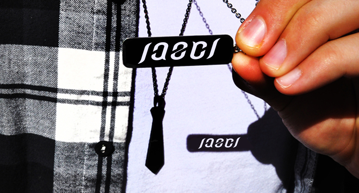
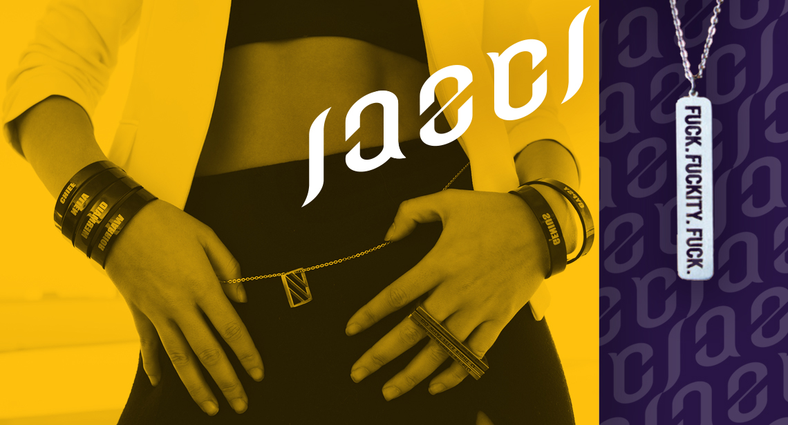
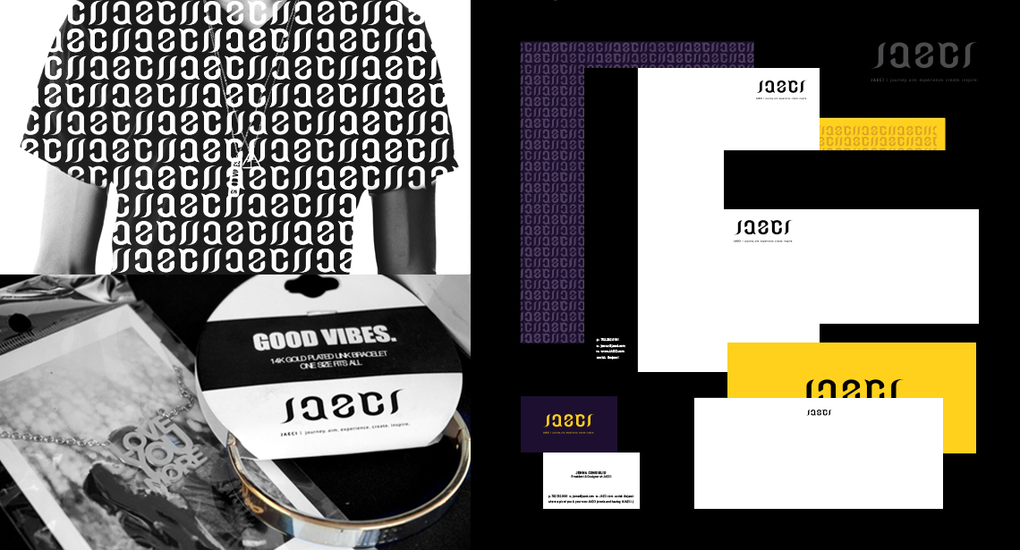
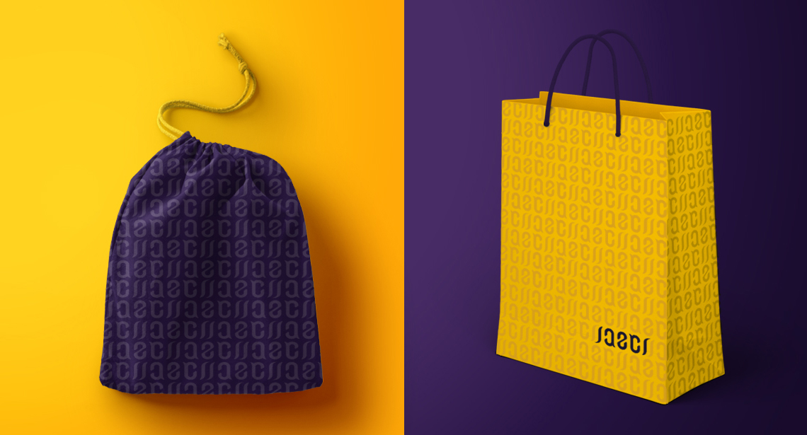
Feellng like a badass is something we do most days at Jacober Creative, and that’s the goal of the JAECI jewelry line, to empower their clients to go out and well, kick ass! They needed to completely update their logo and branding with a cleaner and more contemporary look, and we had just the idea – an ambigram. Ok, you’re asking, what the h…? It means a word that reads the same from more than one angle.
We took their name, which is already an acronym that means journey, aim, experience, create, inspire, and created a custom font that did the trick. Upside down or right side up, a unique logo for a unique jewelry line designed to inspire and provoke conversations. It’s a mind-engaging concept that’s a great fit for their “beautiful pieces with a purpose.”
