Branding / Logo / Web
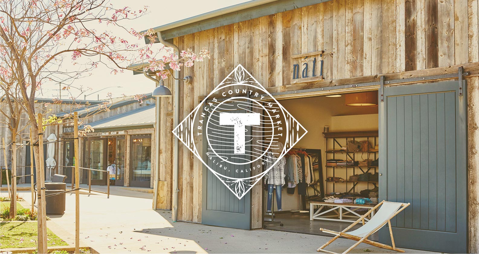
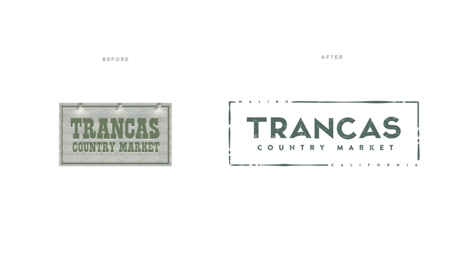
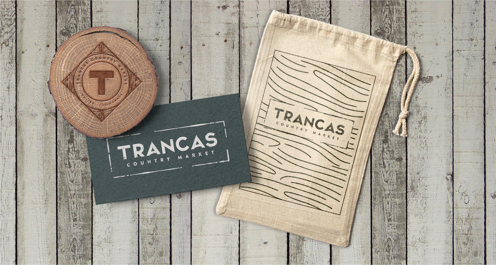
Trancas Country Market is a beautiful shopping center located in western Malibu, CA whose tenants include artisanal boutiques, quaint coffee shops, farm to table dining experiences, an organic grocery, and a unique floral garden nursery. Their goal was to update the branding with a fresh feel that would appeal to both prospective tenants and the Malibu community. The original Trancas Country Market logo was a basic country western themed font. After meeting with the group we wanted to showcase something more stylized & unique. Our goal was to capture the barefoot elegance of the area but upgrade the overall identity.
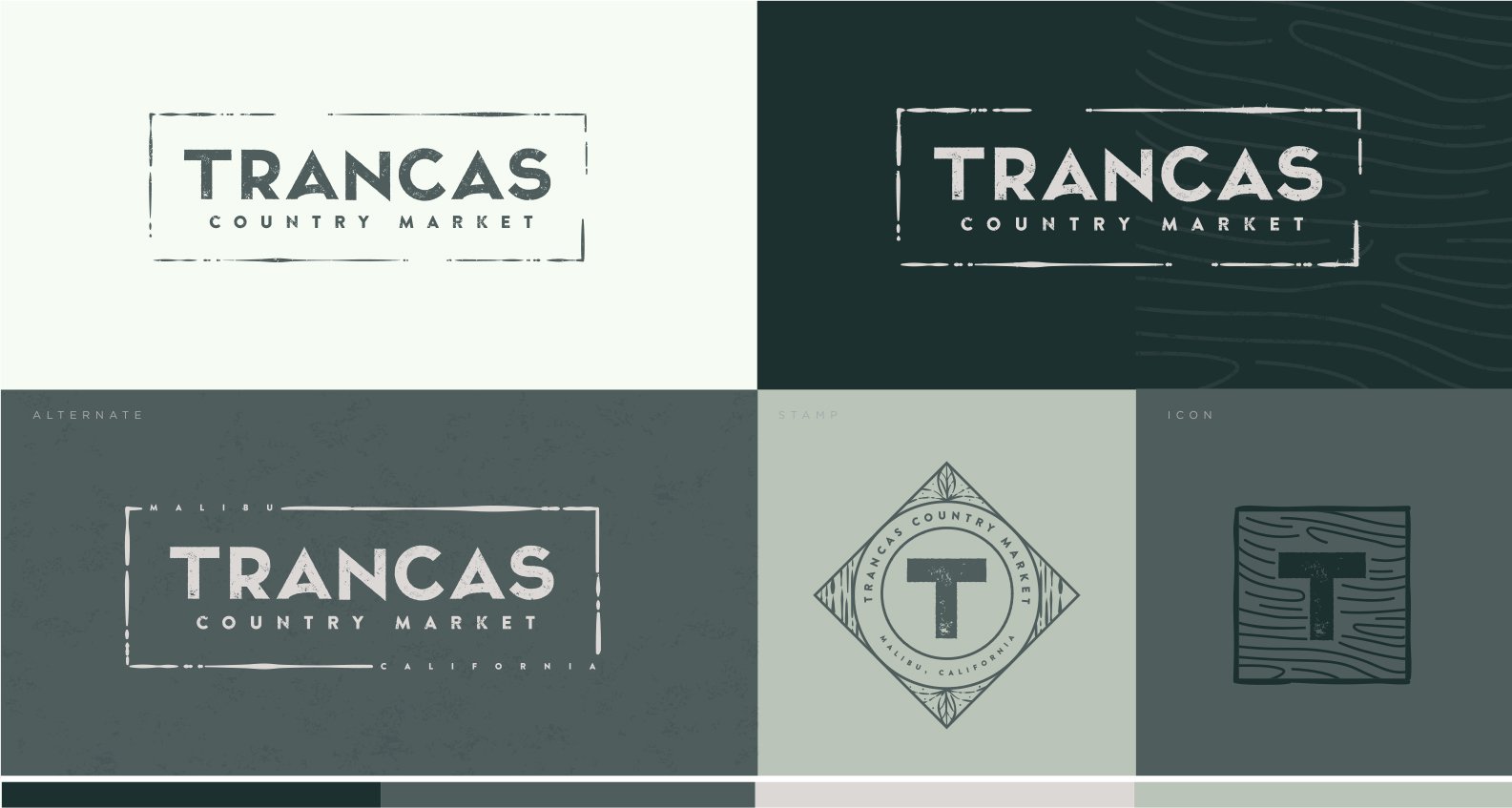
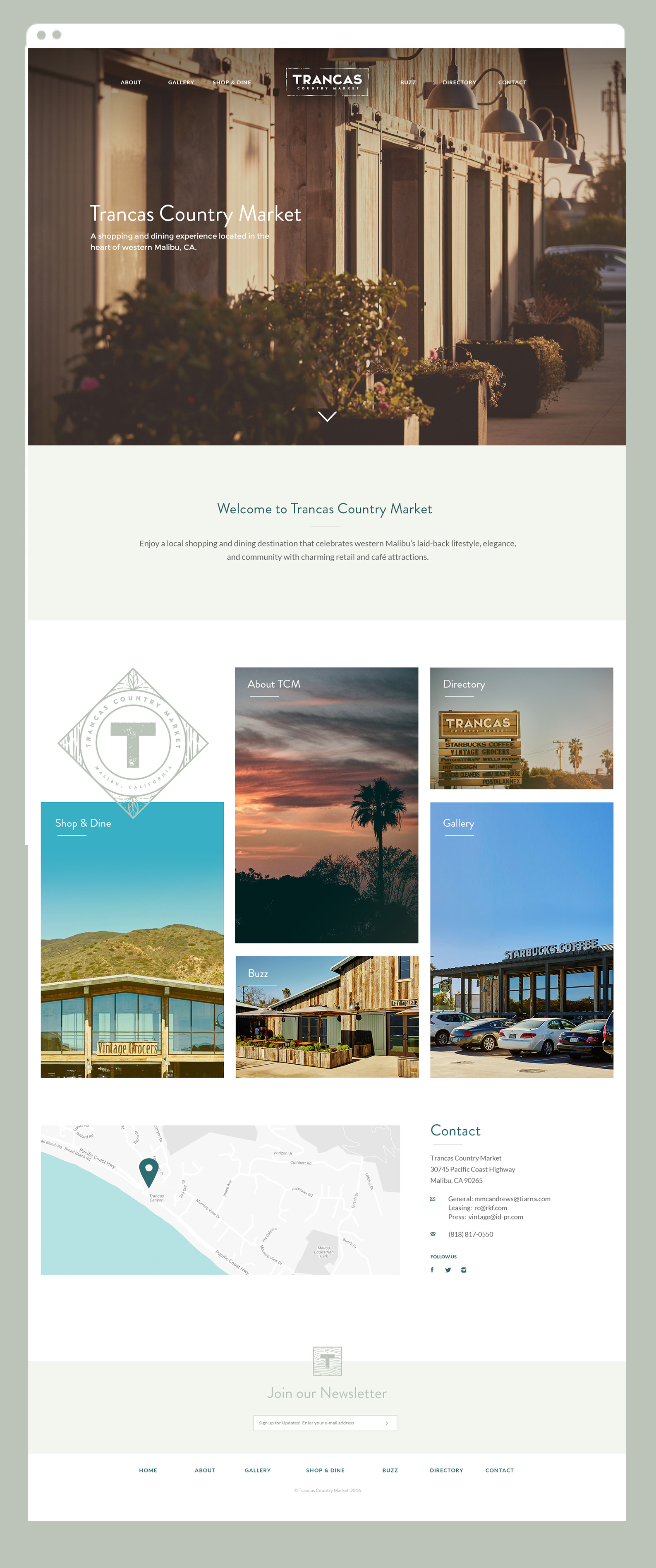
We took a clean sans serif font and customized it to make it more unique: emphasizing the word “Trancas” and stacking “Country Market” underneath, encasing it in a rustic rectangle. The logo is instantly approachable and friendly, just like the destination. For the website, we wanted to continue building on Malibu’s sense of community and physical geography. Strong photography is the core to the Trancas Country Market website. Large, dramatic backstretch images pair well with concise blocks of content to keep the user experience quick and simple. The end result: simple, fast-loading pages, constant layout and cross platform browser compatibility.
