Who doesn’t love an old fashioned country store? Especially one that’s located in Malibu, California, that Hollywood-connected, beachside-but-forever-chic town we’d all love to live in. Come on in, the west coast water’s fine […]

Who doesn’t love an old fashioned country store? Especially one that’s located in Malibu, California, that Hollywood-connected, beachside-but-forever-chic town we’d all love to live in. Come on in, the west coast water’s fine […]


Who doesn’t love an old fashioned country store? Especially one that’s located in Malibu, California, that Hollywood-connected, beachside-but-forever-chic town we’d all love to live in. Come on in, the west coast water’s fine and so are the collection of boutique eateries and unique retail that make up Trancas Country Market. They’ve been around for a while but needed an updating of their brand image, one that could speak to the local well heeled residents, as well as the visiting surfer and tourist crowd. They wanted something that would provide continuity with their past but kick things up a notch.
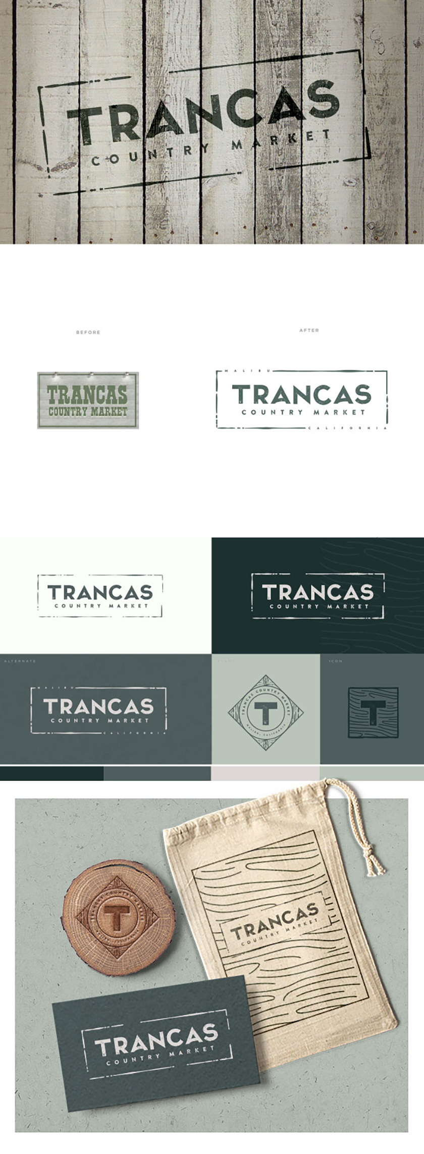
The logo we created uses a customized font that reflects the country feel of Trancas, while also aligning the brand with a more modern aesthetic. The angles of each “A” echoes the A-frame style of their main building, while the subtle fading of both the letter edges and the surrounding outline echoes the lived-in and welcoming feel of the business. And we (and the client of course) love how the logo could work on things from outdoor signage to recyclable shopping bags to business cards. We’re California dreaming about good food, artisanal wares, surfer dudes, and Malibu’s Trancas Country Market.