By now, most of you have heard the fun news.
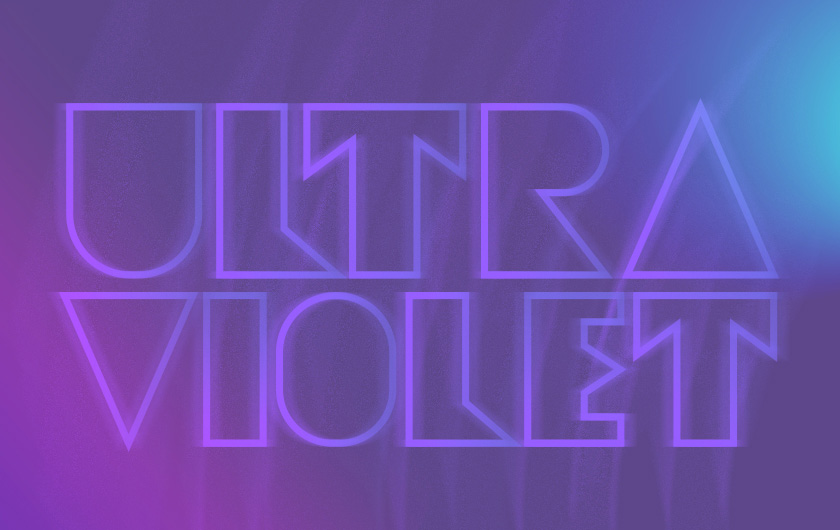
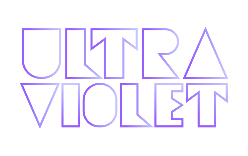
The Pantone Color Institute has deemed PANTONE 18-3838 Ultra Violet, a purple-highlighter shade as the color of 2018.
The Color Purple


By now, most of you have heard the fun news.
The Pantone Color Institute has deemed PANTONE 18-3838 Ultra Violet, a purple-highlighter shade as the color of 2018.
So what’s the story of purple? Historically, there has been a mystical or spiritual quality attached to Ultra Violet. It is often associated with mindfulness practices, used in lighting for meditation spaces and other gathering places that energize the communities that gather there and inspire connection. (Mindfulness is very on trend).
It also fundamentally combines the stability of blue and the energy of red. According to color theory, the color is traditionally associated with royalty and symbolizes power, nobility, luxury, and ambition. And according to surveys, 75 percent of kids prefer purple to all other colors. Remember
Harold and The Purple Crayon?
Purple is also associated with wisdom, dignity, independence, creativity, mystery, and magic. And since it’s so rarely found in nature, some people consider it to be only artificial. (Say what?) To those people we ask; have you ever seen a passionflower? You’ve never seen a purple so inspiring

Though technically purple is the color of 2018, there are two standout purple moments from this year and last year that we couldn’t not mention. First, there was Hillary Clinton's outfit worn during her concession speech on the morning of November 3rd. She wore purple, the blend of two colors that represent the Democratic and
Republican parties, subtly showing her support for democracy as she talked about unity and faith in the democratic process. The choice was not only smart, it left a big impression with everyone.
And second, how could you discuss the royalty of purple without mentioning the loss of the purple paisley god himself, Prince? His sudden and untimely death in 2016 sent shockwaves around the world and forever cemented his legacy and his association with the color purple.
And though both are associated with a tough moment in time, the concession of our possible first female president was and the death of a rock god, their association with the color purple cements the memory with feelings of strength and purpose.
In our own practice at Jacober Creative, we used purple to communicate this sense of glamorous mysticism for our client, GLAM - a vegan fast-casual dining concept that opened earlier this year in Midtown Miami. The scope of the project was all encompassing - from coming up with the name to determining the color palette. Choosing purple was a natural choice that communicated the rich, glamorous nature of the concept but also helped it stand out-purple isn’t a common color in Miami’s branding scene. And to our delight, purple foods are also a standout on the menu, showing up in everything from the purple cabbage to the ube pie–a delicious pie made of purple sweet potato, gingersnap crumble, and allspice.
For our copywriter, Joanna, the deep purple color of ube reminds her of her Southeast Asian roots. “Ube is used in a traditional Filipino dessert called
sapin-sapin, that my mother and I used to make together when I was a kid. Not only it is delicious–it is a sweet, steamed layered rice cake – but seeing that saturated purple color is tied to a memory that reminds me of both my mom and my heritage.” Not to mention, she’s thrilled that ube is making it onto menus that appeal to the wider public.
And want to know a fun fact? Paul, our founder and creative director, is color blind and sometimes struggles to see purple. But don’t worry, he loves it all the same!
Purple Rain forever!
The Pantone Color Institute forecasts global color trends and helps makers of products select color for brand identity, design, product development and the integration of color as an asset. They are recognized as a leading source of color information around the world and partner with global brands to bring the power, psychology and emotion of color to the fore.
The Pantone Color Institute has been choosing a color of the year since 2000 (Rose Quartz — think millennial pink — was the color of 2015). For 2018, Laurie Eiseman, the head of The Institute said, “We wanted to pick something that brings hope and an uplifting message.” Saying that “intuitive Ultra Violet lights the way to what is yet to come.” Amen to that.
Looking for an agency to bring your ideas to life? We are an award-winning Miami-based agency that specializes in graphic design, branding, logos, digital marketing, websites and video production. Let’s work together. [Contact Us]